
深入学习CSS中如何使用定位(小结)
返回主页 微笑是最初的信仰
CSS中定位介绍
position 属性在英文单词中表示 位置 的意思,在 CSS 中主要作用设置元素的定位。
CSS 中一共有 3 种定位如下:
| 属性值 | 描述 |
|---|---|
| fixed | 设置固定定位。 |
| relative | 设置相对定位。 |
| absolute | 设置绝对定位。 |
固定定位实践
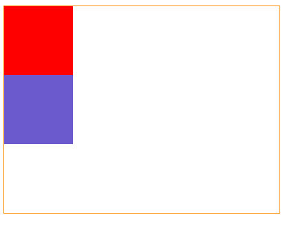
在实践固定定位之前我们先看看代码结构是什么样子的呢。
代码块
<!DOCTYPE html>
<html lang="en">

<head>
  <meta charset="UTF-8">
  <meta name="viewport" content="width=device-width, initial-scale=1.0">
  <meta http-equiv="X-UA-Compatible" content="ie=edge">
  <title>定位</title>
  <style>
     .box{

       width: 100px;
       height: 100px;
       background-color: red;
       margin: 0;
       padding: 0;
     }
     div{
       width: 200px;
       height: 200px;
       background-color:springgreen;
        margin: 0;
        padding: 0;
     }
  </style>
</head>

<body>
   <h1 class="box"></h1>
   <div></div>
</body>

</html>
结果图
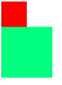
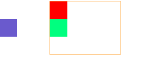
现在笔者将 h1 元素设置为固定定位,看看和上面的结构实践有什么区别,然后我们在分析一些固定定位的特点。
代码块
<!DOCTYPE html>
<html lang="en">

<head>
  <meta charset="UTF-8">
  <meta name="viewport" content="width=device-width, initial-scale=1.0">
  <meta http-equiv="X-UA-Compatible" content="ie=edge">
  <title>定位</title>
  <style>
     .box{
      position:fixed;
       width: 100px;
       height: 100px;
       background-color: red;
       margin: 0;
       padding: 0;
     }
     div{
       width: 200px;
       height: 200px;
       background-color:springgreen;
        margin: 0;
        padding: 0;
     }
  </style>
</head>

<body>
   <h1 class="box"></h1>
   <div></div>
</body>

</html>
结果图
固定定位特点分析如下:
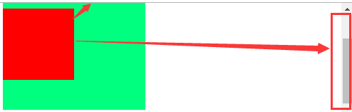
- 固定定位,它是相对于浏览器窗口进行设置定位,不管页面如果滚动,固定定位的元素位置不会受到任何影响。
- 固定定位的元素特点:它已经脱离了标准文档流。
- 固定定位的元素特点:它的层级比标准文档流的元素要高,所以我们给h1标签设置了固定定位会压盖到div标签。
- 固定定位的元素特点:h1标签在div标签之上,所以固定定位的元素已经不再占用任何空间
相对定位实践
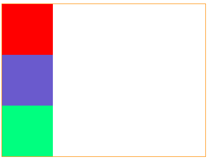
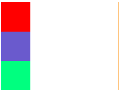
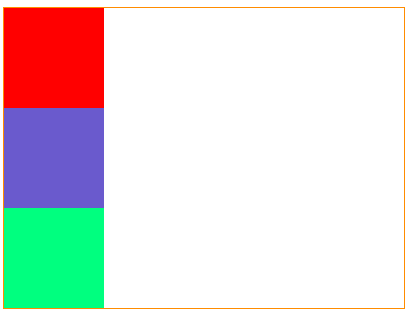
在实践相对定位之前我们先看看代码结构是什么样子的呢。
代码块
<!DOCTYPE html>
<html lang="en">

<head>
  <meta charset="UTF-8">
  <meta name="viewport" content="width=device-width, initial-scale=1.0">
  <meta http-equiv="X-UA-Compatible" content="ie=edge">
  <title>定位</title>
  <style>
     .box{
      width: 400px;
      height: 300px;
      border:  1px solid darkorange;

     }
    .box div{
       width: 100px;
       height: 100px;
     }
     .div1{
       background-color: red;
     }
     .div2{
       background-color: slateblue;
     }
     .div3{
       background-color: springgreen;
     }
  </style>
</head>

<body>
   <div class="box">
     <div  class="div1"></div>
     <div class="div2"></div>
     <div class="div3"></div>
   </div>
</body>

</html>
结果图
现在笔者将 class 属性值为 .div2 元素设置为相对定位,看看和上面的结构实践有什么区别,然后我们在分析一些相对定位的特点。
代码块
<!DOCTYPE html>
<html lang="en">

<head>
  <meta charset="UTF-8">
  <meta name="viewport" content="width=device-width, initial-scale=1.0">
  <meta http-equiv="X-UA-Compatible" content="ie=edge">
  <title>定位</title>
  <style>
     .box{
      width: 400px;
      height: 300px;
      border:  1px solid darkorange;

     }
    .box div{
       width: 100px;
       height: 100px;
     }
     .div1{
       background-color: red;
     }
     .div2{
       background-color: slateblue;
       position: relative;
     }
     .div3{
       background-color: springgreen;
     }
  </style>
</head>

<body>
   <div class="box">
     <div  class="div1"></div>
     <div class="div2"></div>
     <div class="div3"></div>
   </div>
</body>

</html>
结果图
注意:在我们没有给相对定位设置坐标位置,它是不会有任何移动的。
笔者给 class 属性值为 div2 元素设置定位坐标实践。
代码块
<!DOCTYPE html>
<html lang="en">

<head>
  <meta charset="UTF-8">
  <meta name="viewport" content="width=device-width, initial-scale=1.0">
  <meta http-equiv="X-UA-Compatible" content="ie=edge">
  <title>定位</title>
  <style>
     .box{
      width: 400px;
      height: 300px;
      border:  1px solid darkorange;

     }
    .box div{
       width: 100px;
       height: 100px;
     }
     .div1{
       background-color: red;
     }
     .div2{
       background-color: slateblue;
       position: relative;
       left: 50px;
       top: 50px;
     }
     .div3{
       background-color: springgreen;
     }
  </style>
</head>

<body>
   <div class="box">
     <div  class="div1"></div>
     <div class="div2"></div>
     <div class="div3"></div>
   </div>
</body>

</html>
结果图
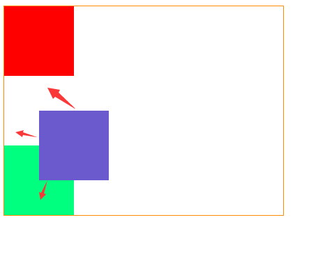
相对定位特点分析如下:
- 相对定位的元素它没有脱离标准文档流。
- 相对定位的元素如果没有设置坐标它会在原地位置。
- 相对定位的元素设置了坐标位置,它会根据原来的位置开始计算移动的位置。
- 相对定位的元素它比标准文档流的元素层级要高,会覆盖标准文档流中的元素。
- 相对定位的元素它可以设置为负数。
绝对定位实践
在实践绝对定位之前我们先看看代码结构是什么样子的呢。
代码块
<!DOCTYPE html>
<html lang="en">

<head>
  <meta charset="UTF-8">
  <meta name="viewport" content="width=device-width, initial-scale=1.0">
  <meta http-equiv="X-UA-Compatible" content="ie=edge">
  <title>定位</title>
  <style>
     .box{
      width: 400px;
      height: 300px;
      border:  1px solid darkorange;

     }
    .box div{
       width: 100px;
       height: 100px;
     }
     .div1{
       background-color: red;
     }
     .div2{
       background-color: slateblue;
     }
     .div3{
       background-color: springgreen;
     }
  </style>
</head>

<body>
   <div class="box">
     <div  class="div1"></div>
     <div class="div2"></div>
     <div class="div3"></div>
   </div>
</body>

</html>
结果图
现在笔者将 class 属性值为 .div2 元素设置为绝对定位,看看和上面的结构实践有什么区别,然后我们在分析一些绝对定位的特点。
代码块
<!DOCTYPE html>
<html lang="en">

<head>
  <meta charset="UTF-8">
  <meta name="viewport" content="width=device-width, initial-scale=1.0">
  <meta http-equiv="X-UA-Compatible" content="ie=edge">
  <title>定位</title>
  <style>
     .box{
      width: 400px;
      height: 300px;
      border:  1px solid darkorange;

     }
    .box div{
       width: 100px;
       height: 100px;
     }
     .div1{
       background-color: red;
     }
     .div2{
       background-color: slateblue;
       position:absolute;
     }
     .div3{
       background-color: springgreen;
     }
  </style>
</head>

<body>
   <div class="box">
     <div  class="div1"></div>
     <div class="div2"></div>
     <div class="div3"></div>
   </div>
</body>

</html>
结果图
注意:绝对定位已经脱离了标准文档流。
笔者给 class 属性值为 div2 元素设置定位坐标实践,为了让读者有一个直观的印象我给最外层的 div 元素设置了居中对齐。
代码块
<!DOCTYPE html>
<html lang="en">

<head>
  <meta charset="UTF-8">
  <meta name="viewport" content="width=device-width, initial-scale=1.0">
  <meta http-equiv="X-UA-Compatible" content="ie=edge">
  <title>定位</title>
  <style>
     .box{
      width: 400px;
      height: 300px;
      border:  1px solid darkorange;
      margin: 0px auto;

     }
    .box div{
       width: 100px;
       height: 100px;
     }
     .div1{
       background-color: red;
     }
     .div2{
       background-color: slateblue;
       position:absolute;
       left:0px ;
     }
     .div3{
       background-color: springgreen;
     }
  </style>
</head>

<body>
   <div class="box">
     <div  class="div1"></div>
     <div class="div2"></div>
     <div class="div3"></div>
   </div>
</body>

</html>
结果图
注意:绝对定位元素为什么会出现在浏览器左边缘呢,绝对定位移动原理:绝对定位的元素它会寻找父元素是否有定位,如果有定位它会根据父元素进行定位,如果父元素没有设置定位,它会在找父元素的父元素是否有定位,以此类推直到 body 元素就停止了,因为 body 元素就是浏览器的位置,说了这么多笔者给新学者一个直观的印象,那咱们就实践见真招。
代码块
<!DOCTYPE html>
<html lang="en">

<head>
  <meta charset="UTF-8">
  <meta name="viewport" content="width=device-width, initial-scale=1.0">
  <meta http-equiv="X-UA-Compatible" content="ie=edge">
  <title>定位</title>
  <style>
     .box{
      width: 400px;
      height: 300px;
      border:  1px solid darkorange;
      margin: 0px auto;
      position: relative;

     }
    .box div{
       width: 100px;
       height: 100px;
     }
     .div1{
       background-color: red;
     }
     .div2{
       background-color: slateblue;
       position:absolute;
       right:0px ;
     }
     .div3{
       background-color: springgreen;
     }
  </style>
</head>

<body>
   <div class="box">
     <div  class="div1"></div>
     <div class="div2"></div>
     <div class="div3"></div>
   </div>
</body>

</html>
结果图
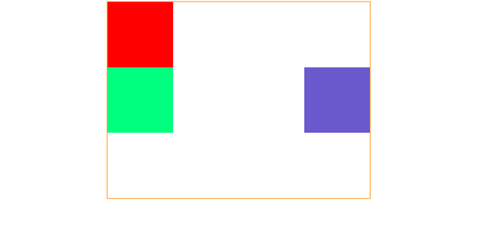
注意:现在笔者给绝对定位坐标更换成了向右定位,父元素设置了一个相对定位,在这里就不多进行实践了,如果定位的父元素的父元素也就是爷爷的元素,父元素和爷爷元素同时都设置了定位,该元素会根据父元素决定定位而不是爷爷元素。
绝对定位特点分析如下:
- 绝对定位元素它已经脱离了标准文档流。
- 绝对定位元素它会覆盖掉标准文档流的元素。
- 绝对定位元素它已经不再占用任何空间了。
- 绝对定位元素它根据父元素之祖先元素之间是否有定位,如果有根据最近元素进行设置定位的位置,如果没有根据body元素进行定位。
- 绝对定位元素的父元素可以是用任何定位包括绝对定位,笔者建议是用相对定位,一般相对定位是配合着绝对定位使用的
以上就是本文的全部内容,希望对大家的学习有所帮助,也希望大家多多支持脚本之家。