
Python数据可视化完全指南之Matplotlib+Seaborn+Plotly用法详解
作者:生当鼎食死封侯
前言
数据本身不会说话,但好的可视化能让数据"开口"。一个精心设计的图表,胜过千言万语的数据描述。
Python 生态中有三个主流的可视化库,它们各有定位:
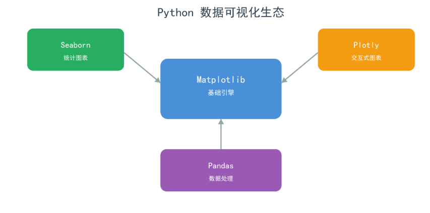
| 库 | 一句话特点 | 最佳场景 |
|---|---|---|
| Matplotlib | 灵活但需要更多代码 | 自定义图表、学术论文 |
| Seaborn | 美观且代码简洁 | 统计分析、EDA |
| Plotly | 交互式、Web 友好 | 仪表盘、在线报告 |
本文将通过大量实际运行的图表,带你全面掌握 Python 数据可视化。
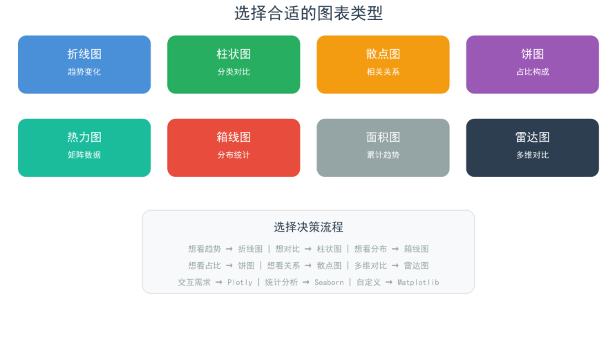
第一章:Matplotlib —— Python 可视化的基石
1.1 快速入门
Matplotlib 是 Python 可视化生态的根基。几乎所有高级可视化库都在它之上构建。
pip install matplotlib
import matplotlib.pyplot as plt
import numpy as np

# 设置中文字体(Windows)
plt.rcParams['font.sans-serif'] = ['SimHei', 'Microsoft YaHei']
plt.rcParams['axes.unicode_minus'] = False
Figure 与 Axes 概念
Matplotlib 有两个核心概念:
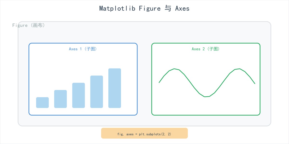
- Figure:整个画布(窗口)
- Axes:画布上的一个子图(包含坐标轴、数据区域)
创建图表有两种风格:
# 方法1: 面向对象风格(推荐)
fig, ax = plt.subplots(figsize=(10, 6))
ax.plot(x, y)
ax.set_title('标题')
ax.set_xlabel('X轴')
plt.show()

# 方法2: pyplot 风格(简单快捷)
plt.figure(figsize=(10, 6))
plt.plot(x, y)
plt.title('标题')
plt.show()
1.2 折线图:展示趋势变化
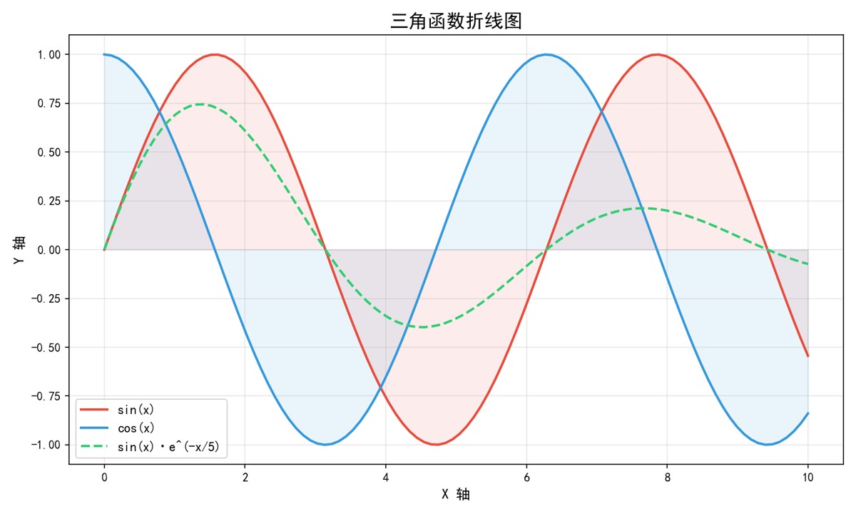
折线图是使用最广泛的图表类型,特别适合展示数据随时间的变化趋势。
运行效果:
x = np.linspace(0, 10, 100)
fig, ax = plt.subplots(figsize=(10, 6))
ax.plot(x, np.sin(x), label='sin(x)', linewidth=2, color='#e74c3c')
ax.plot(x, np.cos(x), label='cos(x)', linewidth=2, color='#3498db')
ax.plot(x, np.sin(x) * np.exp(-x/5), label='sin(x)·e^(-x/5)',
        linewidth=2, color='#2ecc71', linestyle='--')
ax.set_title('三角函数折线图', fontsize=16, fontweight='bold')
ax.legend(fontsize=11)
ax.grid(True, alpha=0.3)
ax.fill_between(x, np.sin(x), alpha=0.1)  # 填充区域
plt.tight_layout()
plt.savefig('折线图.png', dpi=150)
折线图样式参数速查:
| 参数 | 可选值 | 说明 |
|---|---|---|
linestyle | '-', '--', '-.', ':' | 线型 |
linewidth | 数值 | 线宽 |
color | 颜色名/十六进制/RGB元组 | 颜色 |
marker | 'o', 's', '^', '*', '+' | 数据点标记 |
alpha | 0~1 | 透明度 |
1.3 柱状图:对比分类数据
柱状图适合比较不同类别之间的数值差异。
运行效果:
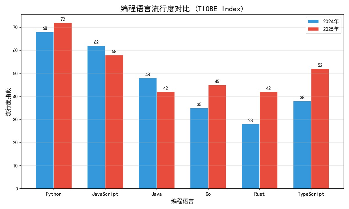
categories = ['Python', 'JavaScript', 'Java', 'Go', 'Rust', 'TypeScript']
values_2024 = [68, 62, 48, 35, 28, 38]
values_2025 = [72, 58, 42, 45, 42, 52]

x_pos = np.arange(len(categories))
width = 0.35

fig, ax = plt.subplots(figsize=(10, 6))
bars1 = ax.bar(x_pos - width/2, values_2024, width, label='2024年', color='#3498db')
bars2 = ax.bar(x_pos + width/2, values_2025, width, label='2025年', color='#e74c3c')

# 添加数值标签
for bar in bars1:
    ax.text(bar.get_x() + bar.get_width()/2., bar.get_height() + 0.5,
            f'{int(bar.get_height())}', ha='center', fontsize=10)

ax.set_title('编程语言流行度对比', fontsize=16, fontweight='bold')
ax.set_xticks(x_pos)
ax.set_xticklabels(categories)
ax.legend()
ax.grid(axis='y', alpha=0.3)
柱状图变体:
# 水平柱状图
ax.barh(y_pos, values, height=0.6)

# 堆叠柱状图
ax.bar(categories, values1, label='A')
ax.bar(categories, values2, bottom=values1, label='B')

# 分组柱状图(上面示例)
ax.bar(x - width/2, values1, width, label='A')
ax.bar(x + width/2, values2, width, label='B')
1.4 散点图:发现数据关联
散点图展示两个变量之间的关系,是探索性数据分析(EDA)中最常用的图表。
运行效果:
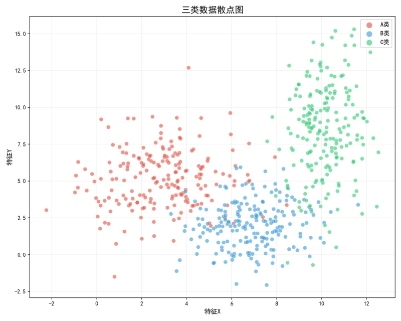
np.random.seed(42)
n = 200
fig, ax = plt.subplots(figsize=(10, 8))

# 三类数据点
ax.scatter(x1, y1, alpha=0.6, s=50, c='#e74c3c', label='A类')
ax.scatter(x2, y2, alpha=0.6, s=50, c='#3498db', label='B类')
ax.scatter(x3, y3, alpha=0.6, s=50, c='#2ecc71', label='C类')

ax.set_title('三类数据散点图', fontsize=16, fontweight='bold')
ax.legend(fontsize=11)
ax.grid(True, alpha=0.2)
散点图高级参数:
| 参数 | 说明 | 示例 |
|---|---|---|
s | 点的大小 | s=50 或 s=array_of_sizes |
c | 点的颜色 | c='red' 或 c=array_of_values |
cmap | 颜色映射 | cmap='viridis' |
alpha | 透明度 | alpha=0.6 |
edgecolors | 边框颜色 | edgecolors='white' |
marker | 标记形状 | marker='o', 's', '^' |
1.5 饼图:展示占比关系
运行效果:
languages = ['Python', 'JavaScript', 'Java', 'Go', 'Rust', '其他']
shares = [30, 25, 18, 12, 8, 7]
colors = ['#3498db', '#f39c12', '#e74c3c', '#2ecc71', '#9b59b6', '#95a5a6']
explode = (0.05, 0.02, 0.02, 0.02, 0.02, 0.02)  # 突出显示某块

fig, ax = plt.subplots(figsize=(9, 9))
wedges, texts, autotexts = ax.pie(
    shares, labels=languages, colors=colors, explode=explode,
    autopct='%1.1f%%', shadow=True, startangle=90
)
ax.set_title('编程语言市场份额 (2025)', fontsize=16, fontweight='bold')
建议:饼图类别不宜超过 6 个。超过 6 个建议使用水平柱状图替代。
1.6 子图布局:一图多表
运行效果:
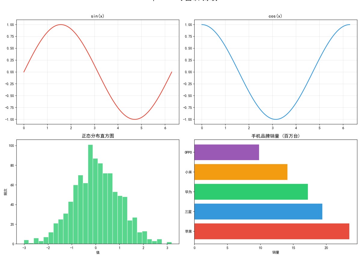
fig, axes = plt.subplots(2, 2, figsize=(14, 10))

# 子图1: 正弦曲线
axes[0, 0].plot(x, np.sin(x), color='#e74c3c', linewidth=2)
axes[0, 0].set_title('sin(x)', fontsize=13)
axes[0, 0].grid(True, alpha=0.3)

# 子图2: 余弦曲线
axes[0, 1].plot(x, np.cos(x), color='#3498db', linewidth=2)
axes[0, 1].set_title('cos(x)', fontsize=13)

# 子图3: 直方图
axes[1, 0].hist(data, bins=30, color='#2ecc71', edgecolor='white')
axes[1, 0].set_title('正态分布直方图')

# 子图4: 水平柱状图
axes[1, 1].barh(brands, sales, color=['#e74c3c', '#3498db', ...])
axes[1, 1].set_title('手机品牌销量')

fig.suptitle('子图布局示例', fontsize=18, fontweight='bold')
plt.tight_layout()
子图布局方法对比:
| 方法 | 适用场景 | 示例 |
|---|---|---|
plt.subplots(nrows, ncols) | 规则网格 | subplots(2, 3) → 2行3列 |
fig.add_subplot(1,2,1) | 不规则布局 | 手动添加每个子图 |
plt.subplot2grid((3,3), (0,0), colspan=2) | 跨行/列布局 | 精确控制每个子图位置 |
gridspec.GridSpec | 最灵活 | 完全自定义布局 |
1.7 热力图:矩阵可视化
运行效果:
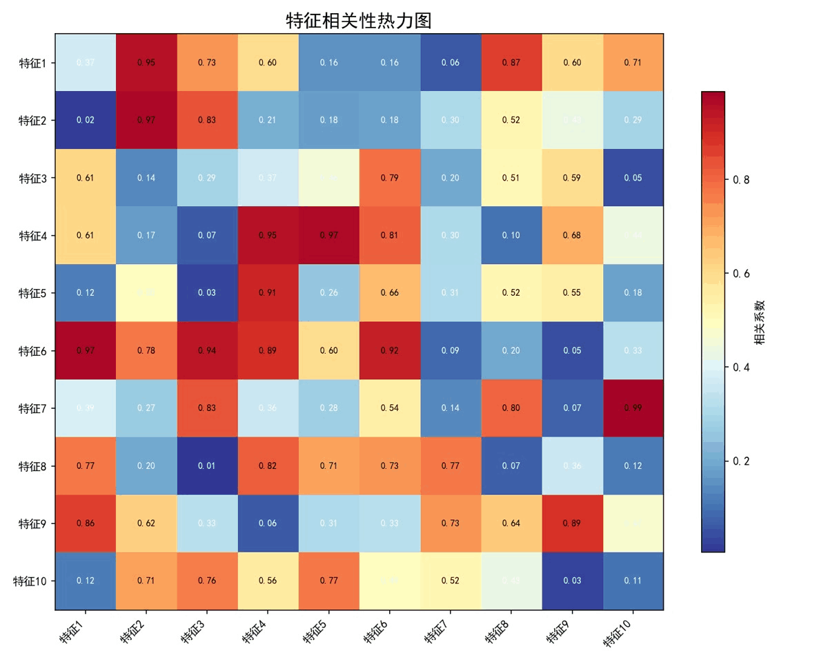
np.random.seed(42)
data = np.random.rand(10, 10)

fig, ax = plt.subplots(figsize=(10, 8))
im = ax.imshow(data, cmap='RdYlBu_r', aspect='auto')

# 添加数值标注
for i in range(10):
    for j in range(10):
        ax.text(j, i, f'{data[i, j]:.2f}', ha='center', va='center',
                fontsize=8, color='black' if data[i, j] > 0.5 else 'white')

plt.colorbar(im, ax=ax, shrink=0.8, label='相关系数')
ax.set_title('特征相关性热力图', fontsize=16, fontweight='bold')
常用颜色映射(colormap):
| 类型 | 名称 | 适用场景 |
|---|---|---|
| 顺序型 | 'viridis', 'Blues', 'Greens' | 连续数值,从低到高 |
| 发散型 | 'RdYlBu', 'coolwarm', 'seismic' | 有中间值的正负数据 |
| 分类型 | 'Set1', 'Set2', 'tab10' | 不同类别区分 |
| 灰度 | 'gray', 'Greys' | 黑白打印 |
1.8 面积图与箱线图
面积图
运行效果:
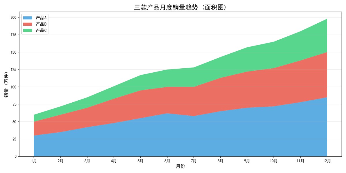
months = ['1月', '2月', '3月', '4月', '5月', '6月', '7月', '8月', '9月', '10月', '11月', '12月']
product_a = [30, 35, 42, 48, 55, 62, 58, 65, 70, 72, 78, 85]
product_b = [20, 25, 28, 35, 40, 38, 42, 48, 52, 55, 60, 65]
product_c = [10, 12, 15, 18, 22, 25, 28, 30, 35, 38, 42, 48]

fig, ax = plt.subplots(figsize=(12, 6))
ax.stackplot(months, product_a, product_b, product_c,
             labels=['产品A', '产品B', '产品C'],
             colors=['#3498db', '#e74c3c', '#2ecc71'], alpha=0.8)
ax.set_title('三款产品月度销量趋势', fontsize=16, fontweight='bold')
ax.legend(loc='upper left')
面积图适合展示部分与整体的关系随时间的变化。stackplot 是堆叠面积图,每个系列在前一个之上叠加。
箱线图
运行效果:
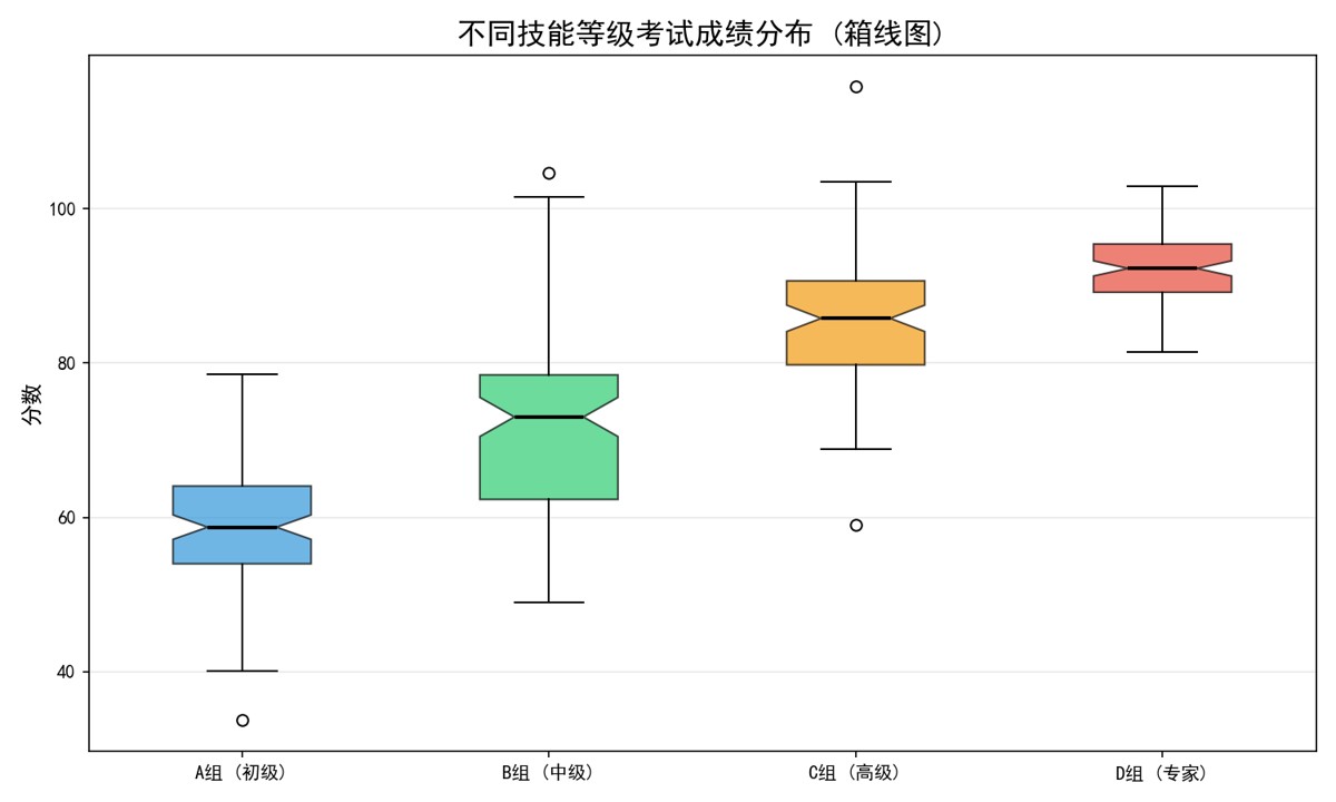
data_groups = {
    'A组 (初级)': np.random.normal(60, 10, 100),
    'B组 (中级)': np.random.normal(72, 12, 100),
    'C组 (高级)': np.random.normal(85, 8, 100),
    'D组 (专家)': np.random.normal(92, 5, 100),
}

fig, ax = plt.subplots(figsize=(10, 6))
bp = ax.boxplot(data_groups.values(), tick_labels=data_groups.keys(),
                patch_artist=True, notch=True)

colors = ['#3498db', '#2ecc71', '#f39c12', '#e74c3c']
for patch, color in zip(bp['boxes'], colors):
    patch.set_facecolor(color)
    patch.set_alpha(0.7)
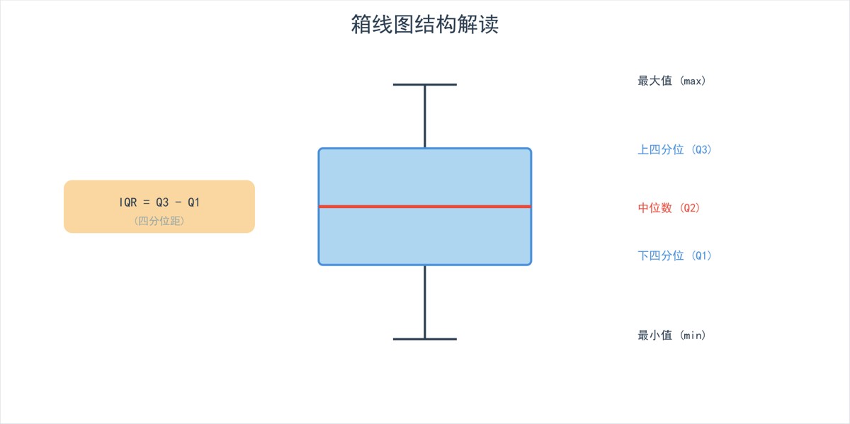
箱线图解读指南:
1.9 雷达图:多维度对比
运行效果:
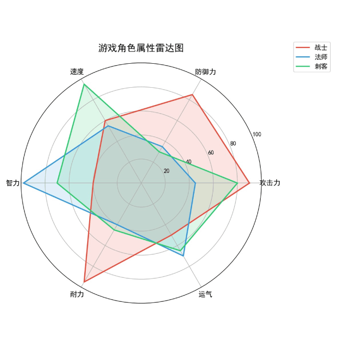
categories = ['攻击力', '防御力', '速度', '智力', '耐力', '运气']
player_stats = {
    '战士': [90, 85, 60, 40, 95, 50],
    '法师': [45, 35, 55, 98, 40, 70],
    '刺客': [80, 30, 95, 70, 45, 65],
}

angles = np.linspace(0, 2 * np.pi, len(categories), endpoint=False).tolist()
angles += angles[:1]  # 闭合

fig, ax = plt.subplots(figsize=(8, 8), subplot_kw=dict(polar=True))
for name, stats in player_stats.items():
    values = stats + stats[:1]
    ax.fill(angles, values, alpha=0.15)
    ax.plot(angles, values, linewidth=2, label=name)

ax.set_xticks(angles[:-1])
ax.set_xticklabels(categories, fontsize=12)
ax.set_ylim(0, 100)
ax.set_title('游戏角色属性雷达图', fontsize=16, pad=20)
ax.legend(loc='upper right', bbox_to_anchor=(1.3, 1.1))
1.10 图表美化技巧
配色方案
# Matplotlib 内置颜色
colors = {
    'blue': '#1f77b4',
    'orange': '#ff7f0e',
    'green': '#2ca02c',
    'red': '#d62728',
    'purple': '#9467bd',
    'brown': '#8c564b',
    'pink': '#e377c2',
    'gray': '#7f7f7f',
    'olive': '#bcbd22',
    'cyan': '#17becf',
}

# Seaborn 调色板(更美观)
import seaborn as sns
palette = sns.color_palette('Set2', 6)
字体设置
plt.rcParams['font.size'] = 12        # 默认字体大小
plt.rcParams['axes.titlesize'] = 16   # 标题大小
plt.rcParams['axes.labelsize'] = 14   # 轴标签大小
plt.rcParams['legend.fontsize'] = 11  # 图例大小
plt.rcParams['xtick.labelsize'] = 10  # X轴刻度大小
保存图表
plt.savefig('chart.png', dpi=150, bbox_inches='tight', transparent=False)
# dpi: 分辨率 (150=高清, 300=印刷级)
# bbox_inches='tight': 自动裁剪空白
# transparent=True: 透明背景
第二章:Seaborn —— 统计图表专家
2.1 Seaborn 与 Matplotlib 的关系
Seaborn 是基于 Matplotlib 的高级封装,提供了:
- 更美观的默认样式
- 更简洁的 API
- 更好的统计图表支持
- 与 Pandas DataFrame 无缝集成
pip install seaborn
import seaborn as sns
import matplotlib.pyplot as plt

# 设置 Seaborn 样式
sns.set_theme(style='whitegrid', palette='Set2', font_scale=1.2)
2.2 分布图
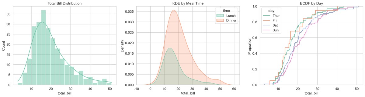
直方图 + 核密度估计 (KDE)
tips = sns.load_dataset('tips')

fig, axes = plt.subplots(1, 3, figsize=(16, 5))

# 直方图
sns.histplot(data=tips, x='total_bill', bins=20, kde=True, ax=axes[0])
axes[0].set_title('总账单分布 (直方图+KDE)')

# KDE 图
sns.kdeplot(data=tips, x='total_bill', hue='time', fill=True, ax=axes[1])
axes[1].set_title('按用餐时间的KDE')

# ECDF 图
sns.ecdfplot(data=tips, x='total_bill', hue='day', ax=axes[2])
axes[2].set_title('经验累积分布函数')
plt.tight_layout()
运行效果:
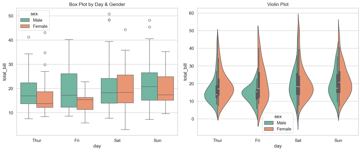
箱线图 + 小提琴图
fig, axes = plt.subplots(1, 2, figsize=(14, 6))

# 箱线图
sns.boxplot(data=tips, x='day', y='total_bill', hue='sex', ax=axes[0])
axes[0].set_title('按日期和性别的账单分布')

# 小提琴图(显示分布形状)
sns.violinplot(data=tips, x='day', y='total_bill', hue='sex',
               split=True, ax=axes[1])
axes[1].set_title('小提琴图 - 分布形状')
plt.tight_layout()
运行效果:
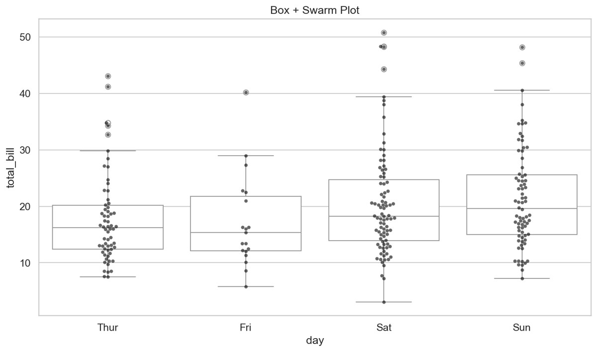
蜂群图 + 箱线图组合
fig, ax = plt.subplots(figsize=(10, 6))
sns.boxplot(data=tips, x='day', y='total_bill', color='white', ax=ax)
sns.swarmplot(data=tips, x='day', y='total_bill', color='black',
              alpha=0.6, size=4, ax=ax)
ax.set_title('箱线图 + 蜂群图')
运行效果:
2.3 分类图
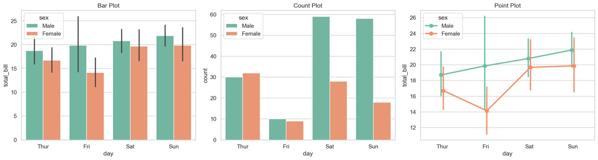
柱状图
fig, axes = plt.subplots(1, 3, figsize=(18, 5))
# 柱状图(带置信区间)
sns.barplot(data=tips, x='day', y='total_bill', hue='sex', ax=axes[0])
axes[0].set_title('柱状图 (带95%置信区间)')
# 计数图
sns.countplot(data=tips, x='day', hue='sex', ax=axes[1])
axes[1].set_title('计数图')
# 点图(展示均值和置信区间)
sns.pointplot(data=tips, x='day', y='total_bill', hue='sex',
              dodge=True, ax=axes[2])
axes[2].set_title('点图')
plt.tight_layout()
运行效果:
2.4 关系图
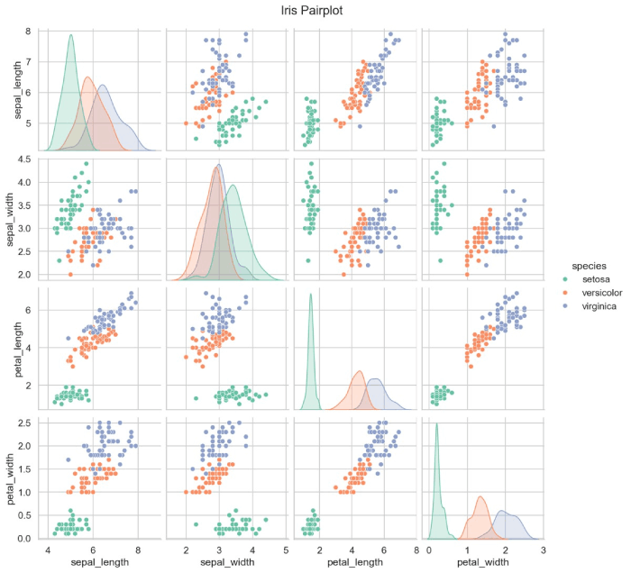
散点图矩阵
iris = sns.load_dataset('iris')
sns.pairplot(iris, hue='species', palette='Set2', diag_kind='kde')
plt.suptitle('鸢尾花数据集散点图矩阵', y=1.02)
运行效果:
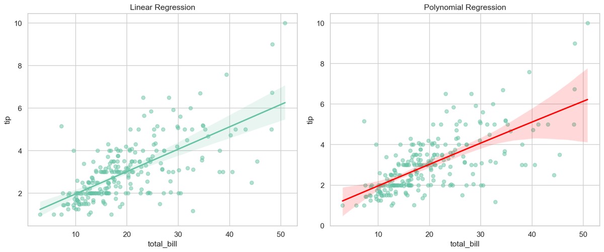
回归散点图
fig, axes = plt.subplots(1, 2, figsize=(14, 6))

# 线性回归
sns.regplot(data=tips, x='total_bill', y='tip', ax=axes[0],
            scatter_kws={'alpha': 0.5})
axes[0].set_title('线性回归拟合')

# 多项式回归
sns.regplot(data=tips, x='total_bill', y='tip', order=2, ax=axes[1],
            scatter_kws={'alpha': 0.5}, line_kws={'color': 'red'})
axes[1].set_title('多项式回归拟合')
plt.tight_layout()
运行效果:
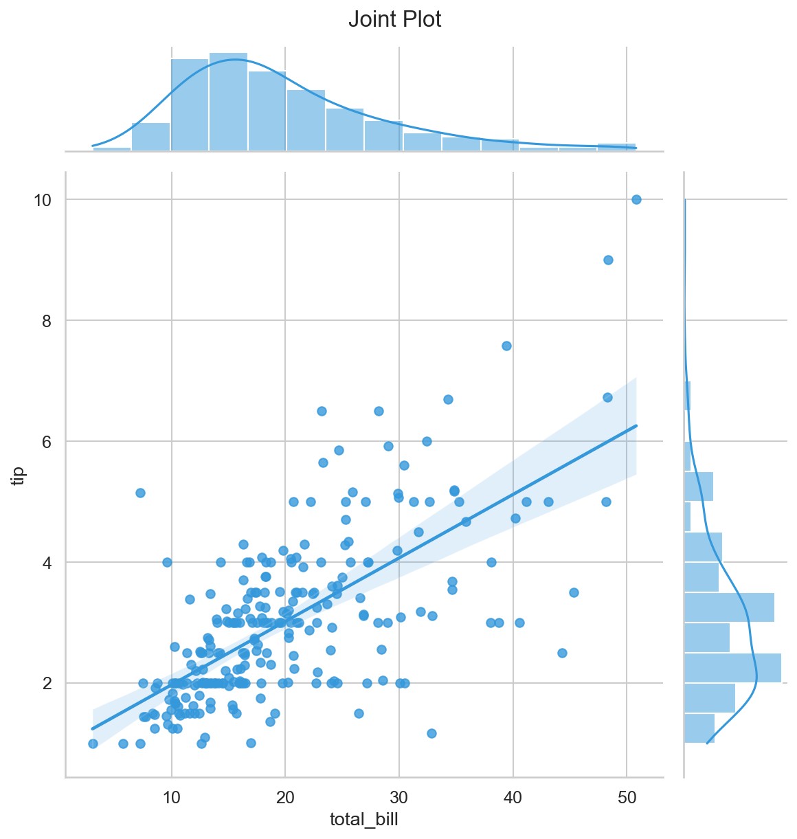
联合分布图
g = sns.jointplot(data=tips, x='total_bill', y='tip', kind='reg',
                  height=8, color='#3498db')
g.fig.suptitle('联合分布图', y=1.02)
运行效果:
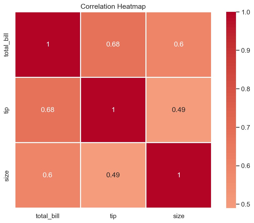
2.5 矩阵图
# 热力图(相关系数矩阵)
fig, ax = plt.subplots(figsize=(10, 8))
corr = tips[['total_bill', 'tip', 'size']].corr()
sns.heatmap(corr, annot=True, cmap='coolwarm', center=0,
            square=True, linewidths=1, ax=ax)
ax.set_title('特征相关系数热力图')

# 聚类热力图
g = sns.clustermap(corr, cmap='coolwarm', annot=True, figsize=(8, 8))
运行效果:
第三章:Plotly —— 交互式可视化
3.1 交互式图表的优势
Plotly 是一个支持交互的可视化库。与 Matplotlib 生成的静态图片不同,Plotly 的图表可以在浏览器中:
- 缩放:鼠标滚轮放大/缩小
- 悬停:鼠标悬停显示数据详情
- 平移:拖拽移动视图
- 选择:框选/套索选择数据点
- 导出:直接保存为 PNG
pip install plotly
3.2 基础交互图
import plotly.express as px
import plotly.graph_objects as go
import pandas as pd
import numpy as np

# Plotly Express - 最简洁的 API
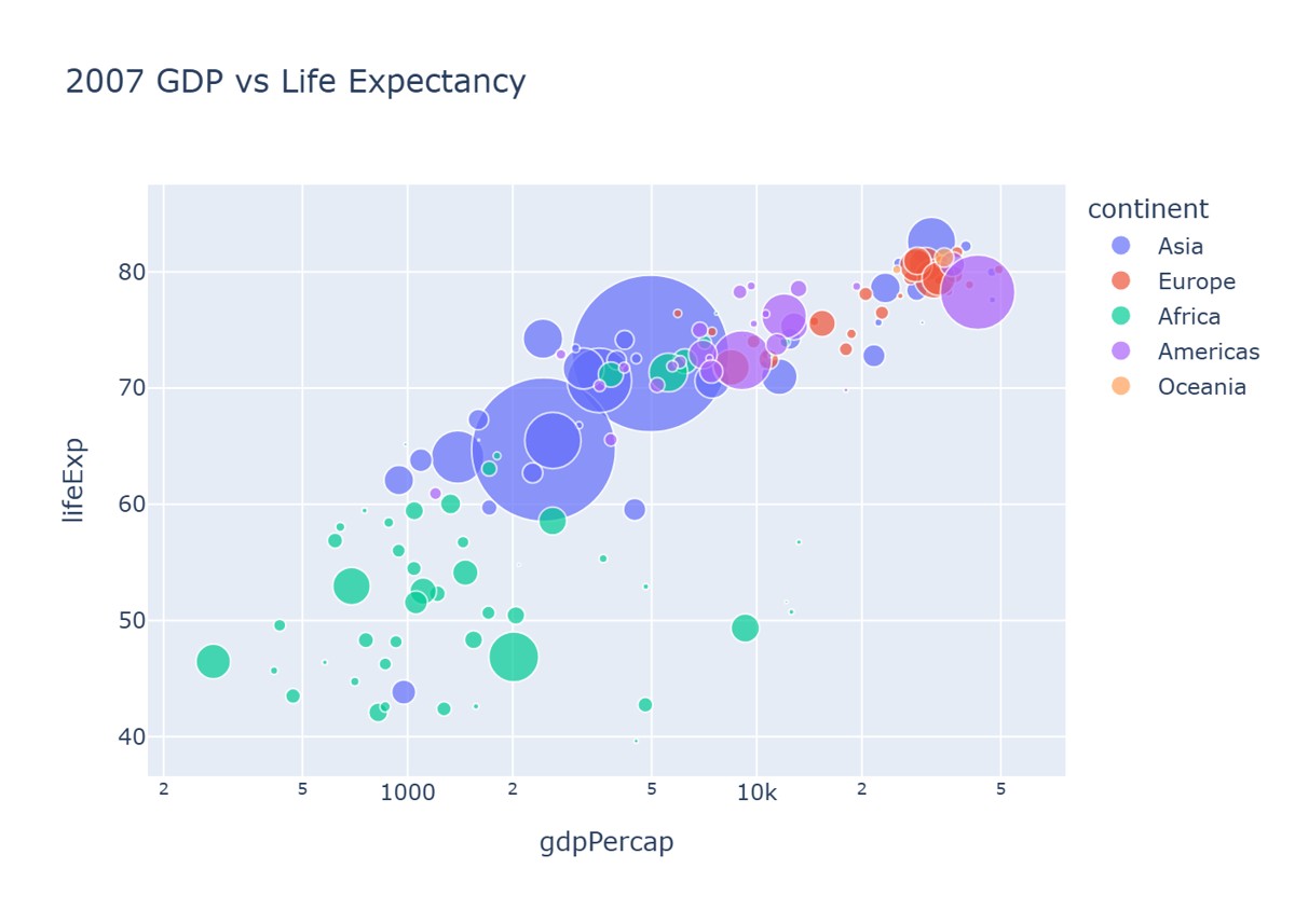
df = px.data.gapminder().query("year == 2007")
fig = px.scatter(df, x='gdpPercap', y='lifeExp',
                 size='pop', color='continent',
                 hover_name='country',
                 log_x=True, size_max=60,
                 title='2007年各国GDP vs 预期寿命')
fig.show()
运行效果:
折线图
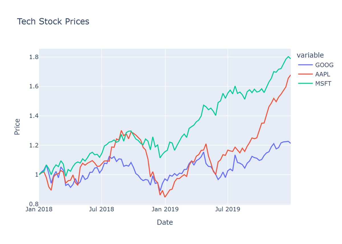
df = px.data.stocks()
fig = px.line(df, x='date', y=['GOOG', 'AAPL', 'MSFT'],
              title='科技股股价走势',
              labels={'value': '股价', 'date': '日期', 'variable': '公司'})
fig.update_layout(hovermode='x unified')
fig.show()
运行效果:
3D 散点图
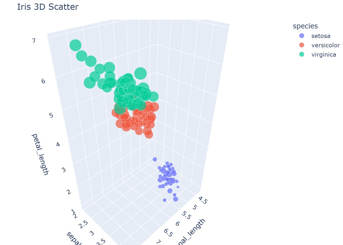
df = px.data.iris()
fig = px.scatter_3d(df, x='sepal_length', y='sepal_width', z='petal_length',
                     color='species', size='petal_width',
                     title='鸢尾花 3D 散点图')
fig.update_layout(margin=dict(l=0, r=0, b=0, t=40))
fig.show()
运行效果:
3.3 子图与布局
from plotly.subplots import make_subplots

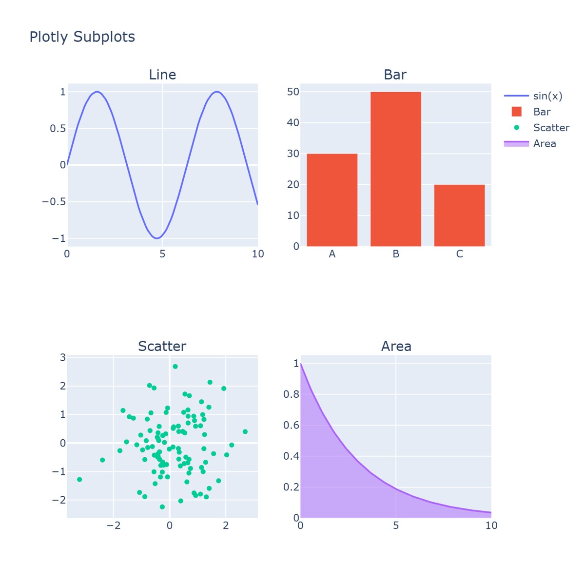
fig = make_subplots(
    rows=2, cols=2,
    subplot_titles=('折线图', '柱状图', '散点图', '面积图'),
    vertical_spacing=0.12, horizontal_spacing=0.1
)

x = np.linspace(0, 10, 100)

# 折线图
fig.add_trace(go.Scatter(x=x, y=np.sin(x), name='sin(x)'), row=1, col=1)

# 柱状图
fig.add_trace(go.Bar(x=['A', 'B', 'C'], y=[30, 50, 20], name='分类'), row=1, col=2)

# 散点图
fig.add_trace(go.Scatter(x=np.random.randn(100), y=np.random.randn(100),
                         mode='markers', name='散点'), row=2, col=1)

# 面积图
fig.add_trace(go.Scatter(x=x, y=np.exp(-x/3), fill='tozeroy', name='衰减'), row=2, col=2)

fig.update_layout(title_text='Plotly 子图布局', height=700, showlegend=True)
fig.show()
运行效果:
三库对比与选择指南
| 特性 | Matplotlib | Seaborn | Plotly |
|---|---|---|---|
| 交互性 | 静态 | 静态 | 完全交互 |
| 代码量 | 多 | 少 | 中等 |
| 自定义能力 | 最强 | 中等 | 强 |
| 默认美观度 | 一般 | 很好 | 很好 |
| 学习曲线 | 中等 | 低 | 低 |
| Pandas集成 | 一般 | 优秀 | 良好 |
| 输出格式 | PNG/PDF/SVG | PNG/PDF/SVG | HTML/PNG |
| 适合场景 | 论文/报告 | EDA/分析 | 仪表盘/Web |
| 3D支持 | 有 | 无 | 优秀 |
| 动画支持 | 有 | 无 | 优秀 |
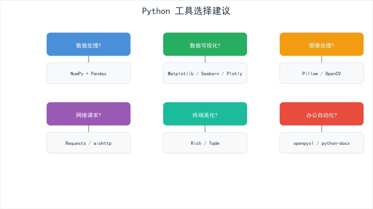
选择建议
最佳实践
- 先用 Seaborn 快速探索,再用 Matplotlib 精细调整
- 交互需求用 Plotly,尤其是面向用户的场景
- 统一配色方案,保持系列文章/报告的视觉一致性
- 保存高分辨率图片(dpi ≥ 150),方便后续使用
- 图表要有标题和标签,让读者一眼理解
以上就是Python数据可视化完全指南之Matplotlib+Seaborn+Plotly用法详解的详细内容,更多关于Python数据可视化的资料请关注脚本之家其它相关文章!
您可能感兴趣的文章:
- Python数据可视化库:Matplotlib、Seaborn、Plotly、Bokeh等对比与选择
- python安装 Matplotlib 库和Seaborn 库的示例详解
- Python数据可视化之Pandas、Matplotlib与Seaborn的高效实战指南
- Python绘图工具使用Matplotlib、Seaborn和Pyecharts绘制散点图详解
- Python使用Matplotlib和Seaborn绘制常用图表的技巧
- Python数据可视化之Matplotlib和Seaborn的使用教程详解
- Python实现Matplotlib,Seaborn动态数据图的示例代码
- Python matplotlib seaborn绘图教程详解
- python可视化分析的实现(matplotlib、seaborn、ggplot2)
- Python AI基础:Matplotlib和Seaborn两大可视化库的原理和使用(实践代码)