
uniapp+vue3实现自定义封装支付密码组件
作者:Pinia_0819
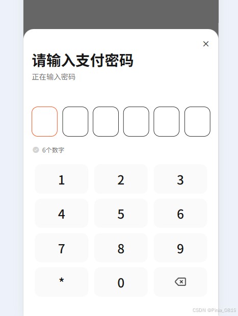
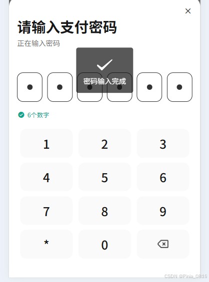
本文介绍使用Vue3语法在uniapp中自定义封装支付密码组件,通过父组件与子组件的交互实现密码输入功能,并附效果图展示,感兴趣的朋友跟随小编一起看看吧
使用uniapp自定义封装支付密码组件(vue3语法)
父组件
<paypassword v-model="passwordValue" @complete="onPasswordComplete"></paypassword>
const passwordValue = ref('')
// 密码输入完成回调
const onPasswordComplete = (password) => {
  console.log('密码输入完成:', password)
  passwordValue.value = password;
  uni.showToast({
    title: '密码输入完成',
    icon: 'success'
  })
}
子组件
<template>
    <view class="password-container">
      <!-- 第一行:6个密码输入框 -->
      <view class="password-input-container">
        <view class="password-input-row">
          <view
            v-for="index in 6"
            :key="index"
            class="password-input-box"
            :class="{ 'active': currentIndex === index - 1 }"
          >
            <view v-if="password[index - 1]" class="password-dot"></view>
          </view>
        </view>
      </view>
      <!-- 第二行:状态图标和文字 -->
      <view class="password-status">
        <uni-icons
          :type="isCompleted ? 'checkbox-filled' : 'checkbox-filled'"
          :color="isCompleted ? '#12a58c' : '#d4d4d4'"
          size="32rpx"
        ></uni-icons>
        <text
          class="status-text"
          :class="{ 'status-text-complete': isCompleted }"
        >
          {{ '6个数字' }}
        </text>
      </view>
      <!-- 第三模块:12宫格数字键盘 -->
      <view class="number-keyboard">
        <view class="keyboard-row" v-for="(row, rowIndex) in keyboardLayout" :key="rowIndex">
          <view
            v-for="(key, keyIndex) in row"
            :key="keyIndex"
            class="keyboard-key"
            @click="handleKeyClick(key)"
          >
            <text v-if="key.type === 'number'" class="key-text">{{ key.value }}</text>
            <!-- 移除按钮可以使用icon,也可以使用自定义图片我使用的是自定义图片 -->
           <!-- <uni-icons
              v-if="key.type === 'delete'"
              type="closeempty"
              size="56rpx"
              color="#171717"
            ></uni-icons> -->
            <image class="delImg" v-if="key.type === 'delete'"  src="/static/image/home/Frame.png" mode=""></image>
          </view>
        </view>
      </view>
    </view>
  </template>
  <script setup>
  import { ref, computed, watch, defineProps, defineEmits } from 'vue'
  // 定义props
  const props = defineProps({
    // 提示文字
    tipText: {
      type: String,
      default: '请输入6位数字密码'
    },
    // 初始密码值
    modelValue: {
      type: String,
      default: ''
    }
  })
  // 定义emits
  const emits = defineEmits(['update:modelValue', 'complete'])
  // 数据状态
  const password = ref([])
  const currentIndex = ref(0)
  // 键盘布局
  const keyboardLayout = [
    [
      { type: 'number', value: '1' },
      { type: 'number', value: '2' },
      { type: 'number', value: '3' }
    ],
    [
      { type: 'number', value: '4' },
      { type: 'number', value: '5' },
      { type: 'number', value: '6' }
    ],
    [
      { type: 'number', value: '7' },
      { type: 'number', value: '8' },
      { type: 'number', value: '9' }
    ],
    [
      { type: 'number', value: '*' },
      { type: 'number', value: '0' },
      { type: 'delete'}
    ]
  ]
  // 计算属性:是否输入完成
  const isCompleted = computed(() => password.value.length === 6)
  // 监听密码完成状态
  watch(isCompleted, (newVal) => {
    if (newVal) {
      const passwordStr = password.value.join('')
      emits('update:modelValue', passwordStr)
      emits('complete', passwordStr)
    }
  })
  // 监听modelValue变化
  watch(() => props.modelValue, (newVal) => {
    if (newVal && newVal.length <= 6) {
      password.value = newVal.split('')
      currentIndex.value = password.value.length
    }
  }, { immediate: true })
  // 处理按键点击
  const handleKeyClick = (key) => {
    if (key.type === 'number') {
      // 输入数字
      if (password.value.length < 6) {
        password.value.push(key.value)
        currentIndex.value = password.value.length
      }
    } else if (key.type === 'delete') {
      // 删除
      if (password.value.length > 0) {
        password.value.pop()
        currentIndex.value = password.value.length
      }
    }
    // 更新modelValue
    const passwordStr = password.value.join('')
    emits('update:modelValue', passwordStr)
  }
  // 重置密码
  const resetPassword = () => {
    password.value = []
    currentIndex.value = 0
  }
  // 暴露方法给父组件
  defineExpose({
    resetPassword
  })
  </script>
  <style lang="scss" scoped>
  .password-container {
    width: 100%;
    padding-top: 96rpx;
    box-sizing: border-box;
    .password-input-container {
      margin-bottom: 32rpx;
      .password-input-row {
        display: flex;
        justify-content: space-between;
        .password-input-box {
          width: 96rpx;
          height: 112rpx;
          border-radius: 24rpx;
          border: 2rpx solid #171717;
          display: flex;
          align-items: center;
          justify-content: center;
          &.active {
            border-color: #FF4001;
          }
          .password-dot {
            width: 20rpx;
            height: 20rpx;
            border-radius: 50%;
            background: #333;
          }
        }
      }
    }
    .password-status {
      display: flex;
      align-items: center;
      margin-bottom: 40rpx;
      .status-text {
        font-family: PingFang SC, PingFang SC;
        font-size: 24rpx;
        color: #737373;
        margin-left: 8rpx;
      }
      .status-text-complete {
        color: #12a58c;
      }
    }
    .number-keyboard {
      .keyboard-row {
        display: flex;
        justify-content: space-around;
        margin-bottom: 20rpx;
        .keyboard-key {
            width: 207rpx;
            height: 112rpx;
            background: #FAFAFA;
            border-radius: 24rpx;
            display: flex;
            align-items: center;
            justify-content: center;
          .key-text {
            font-family: PingFang SC, PingFang SC;
            font-weight: 500;
            font-size: 48rpx;
            color: #171717;
          }
          .delImg {
              width: 56rpx;
              height: 56rpx;
          }
          &.key-delete {
            // background: #e0e0e0;
          }
          &.key-empty {
            // background: transparent;
            // visibility: hidden;
          }
        }
      }
    }
  }
  </style>
效果图:
到此这篇关于uniapp+vue3实现自定义封装支付密码组件的文章就介绍到这了,更多相关vue自定义支付密码内容请搜索脚本之家以前的文章或继续浏览下面的相关文章希望大家以后多多支持脚本之家!