
前端Vue2使用脚手架的详细步骤流程
作者:陈奕迅本讯
vue cli
Vue CLI 的全称是 Vue Command Line Interface,即 Vue 命令行界面。它是一个强大的工具,用于帮助开发者快速搭建、配置和管理 Vue.js 项目。
他的作用
项目创建:
Vue CLI 提供了一个图形化界面和命令行工具,可以快速创建新的 Vue.js 项目,并且可以选择不同的配置和功能预设。
项目配置:
允许开发者自定义项目的构建配置,例如配置 Babel、PostCSS、Webpack 等工具,以及添加额外的插件和功能。
插件生态系统:
Vue CLI 拥有一个丰富的插件生态系统,开发者可以通过安装插件来扩展项目的功能,如添加 Vue Router、Vuex、单元测试等。
开发服务器:
提供一个本地开发服务器,支持热重载(Hot Module Replacement,HMR)功能,让开发者在开发过程中可以实时看到代码更改的效果。
构建和部署:
可以构建项目以生成优化后的静态资源,用于生产环境部署。
版本控制:
支持版本控制,允许开发者在不同版本之间切换,方便进行项目管理和迁移。
代码规范:
可以集成 ESLint、Prettier 等工具,帮助开发者维护代码质量和风格一致性。
图形化界面:
提供了一个图形化界面(@vue/cli-service global),方便进行项目配置和插件管理。
Vue CLI 极大地简化了 Vue.js 应用的开发流程,使得开发者可以更加专注于编写业务逻辑,而不是构建配置和项目管理。它是 Vue.js 生态系统中一个非常重要的工具,被广泛用于构建现代的单页面应用程序(SPA)。
创建Vue2脚手架
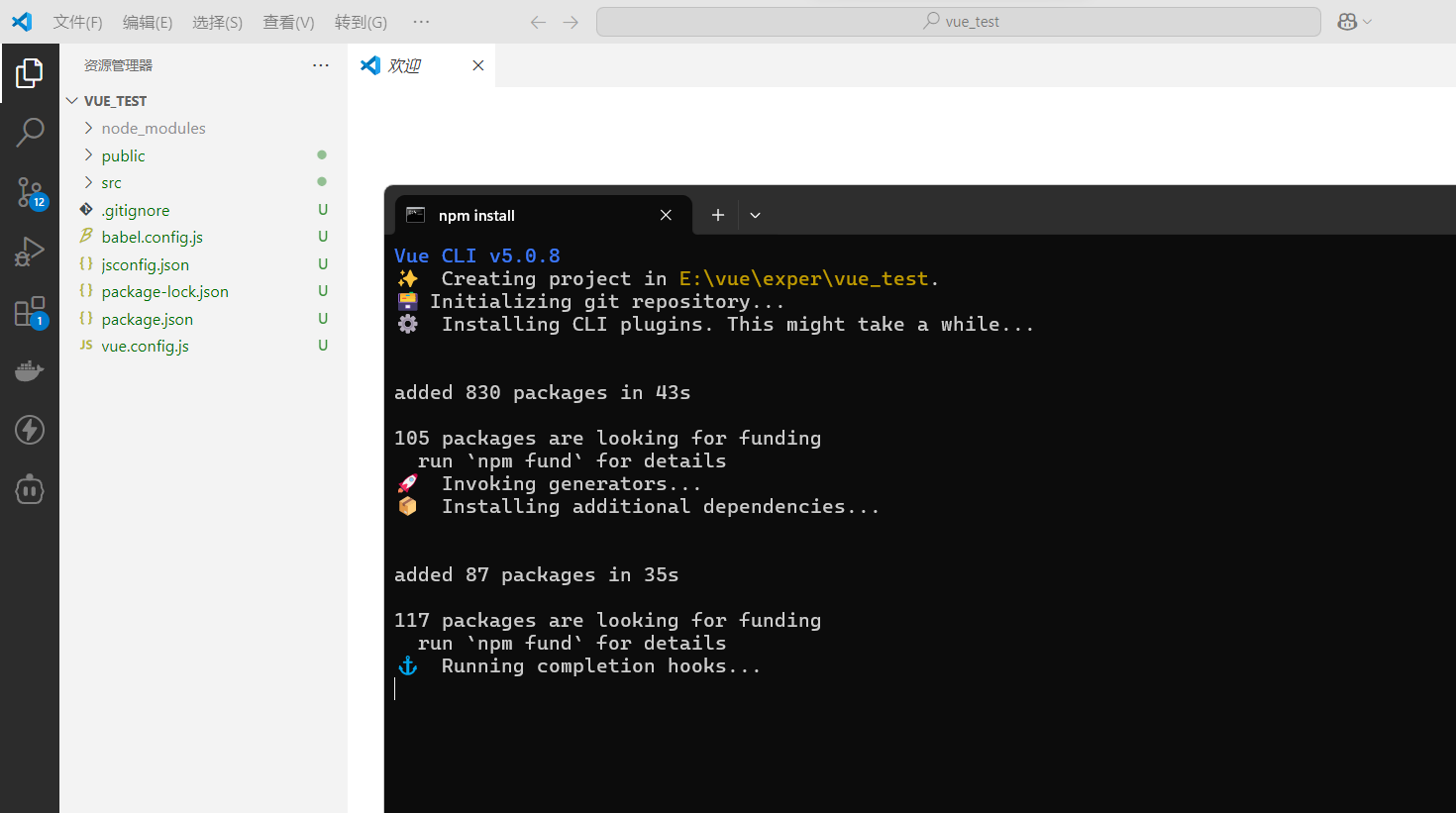
第一步(仅第一次执行):全局安装@vue/cli。
npm install -g @vue/cli
第二步:切换到你要创建项目的目录,然后使用命令创建项目
vue create xxxx
这里我们创建vue create vue_test
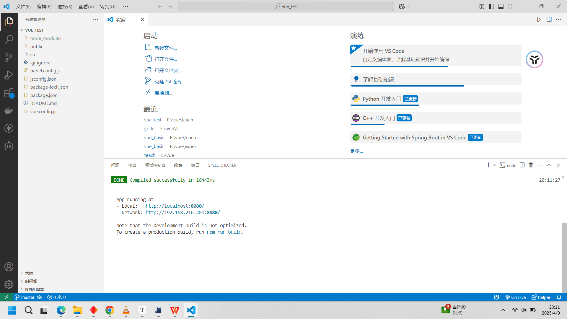
第三步:启动项目
npm run serve
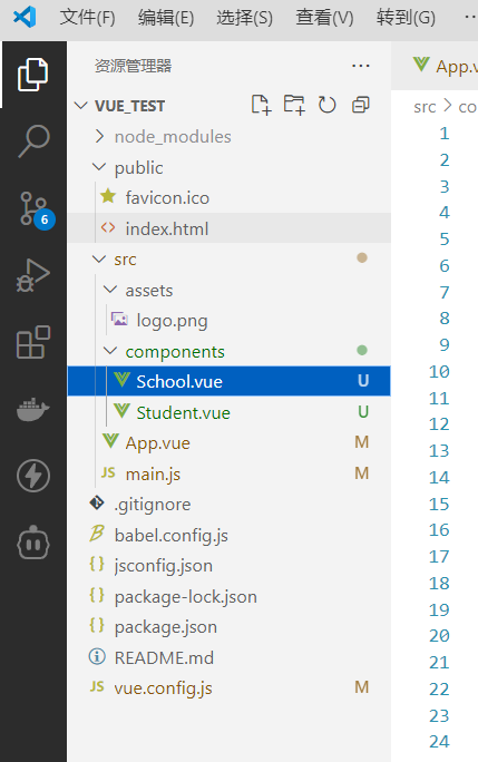
项目结构
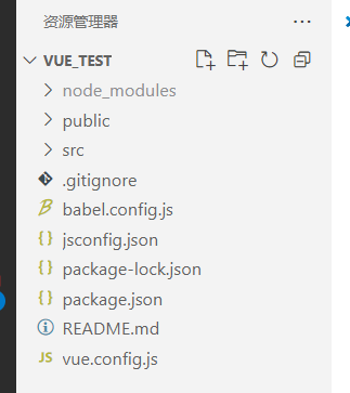
简洁概括
node_modules:
存放项目依赖的所有 Node.js 模块。这些模块是通过
npm install命令安装的,包括 Vue.js 库和其他第三方库。
public:
存放静态资源文件,如
index.html、图标等。这些文件不会被 Webpack 处理,而是直接复制到构建输出目录中。
src:
存放项目的源代码。通常包括组件、路由、状态管理(如 Vuex)、视图等。这是开发者主要编写代码的地方。
.gitignore:
Git 配置文件,用于指定哪些文件或文件夹不应该被 Git 版本控制系统跟踪,如
node_modules、日志文件、编译输出文件等。
babel.config.js:
Babel 配置文件,用于配置 JavaScript 编译器 Babel 的行为,如转译 ES6+ 代码到向后兼容的 JavaScript 版本。
jsconfig.json:
JavaScript 项目配置文件,用于配置编辑器(如 VSCode)的智能提示、代码导航等功能。
package.json:
项目的元数据文件,包含项目的基本信息(如名称、版本、描述)、依赖项、脚本命令等。
package-lock.json:
锁定项目依赖的确切版本,确保项目在不同环境下的一致性。
README.md:
项目的自述文件,通常包含项目的介绍、安装和使用说明、贡献指南等。
vue.config.js:
Vue CLI 的配置文件,用于自定义项目的构建配置,如修改输出目录、调整 Webpack 配置等。
这个目录结构清晰地组织了项目的各个部分,使得项目易于管理和扩展。通过 Vue CLI,开发者可以快速搭建项目,专注于业务逻辑的实现,而不需要关心底层的构建和配置细节。
逐步分析src
我们从文件执行的角度来看这个结构
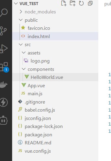
main.js
当我们执行了npm run serve之后,vue就会找到main.js里面执行代码
1 引入了Vue
2 引入了App
3 关闭了启动的提示
4 创建了Vue实例 然后挂载到App容器上(后面会详细讲解)
import Vue from 'vue'
import App from './App.vue'

Vue.config.productionTip = false

new Vue({
  render: h => h(App),
}).$mount('#app')
index.html
挂载到App容器,app容器在index.html,然后就会去执行index.html
<link rel="icon" href="<%= BASE_URL %>favicon.ico">注意这里的代码,这里就是来编写网页的图标的。<%= BASE_URL %>vue会解释,用来解决正常通过 ”./“ 来引入图标在不同服务器上可能出现错误
然后就是noscript,当网页不支持js的时候会显示
之后就是app容器了
<!DOCTYPE html>
<html lang="">
  <head>
    <meta charset="utf-8">
    <meta http-equiv="X-UA-Compatible" content="IE=edge">
    <meta name="viewport" content="width=device-width,initial-scale=1.0">
    <link rel="icon" href="<%= BASE_URL %>favicon.ico" rel="external nofollow" >
    <title><%= htmlWebpackPlugin.options.title %></title>
  </head>
  <body>
    <noscript>
      <strong>We're sorry but <%= htmlWebpackPlugin.options.title %> doesn't work properly without JavaScript enabled. Please enable it to continue.</strong>
    </noscript>
    <div id="app"></div>
    <!-- built files will be auto injected -->
  </body>
</html>
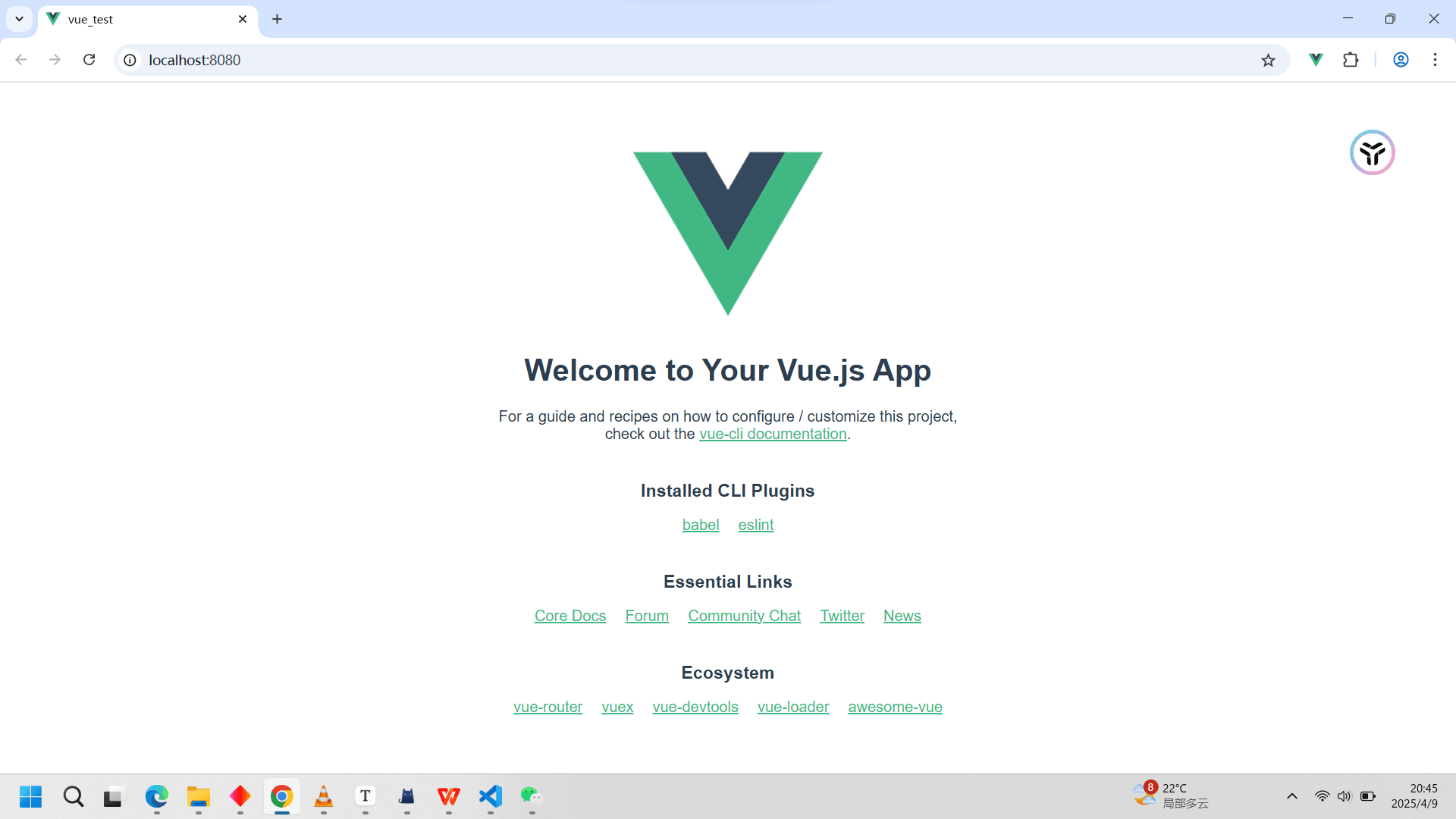
app.vue
当执行到app容器中,就会去执行app.vue文件
可以看到,原始的项目里面vue已经创建了一个HelloWorld 组件并引入了。
<template>
  <div id="app">
    <img alt="Vue logo" src="./assets/logo.png">
    <HelloWorld msg="Welcome to Your Vue.js App"/>
  </div>
</template>

<script>
import HelloWorld from './components/HelloWorld.vue'

export default {
  name: 'App',
  components: {
    HelloWorld
  }
}
</script>

<style>
#app {
  font-family: Avenir, Helvetica, Arial, sans-serif;
  -webkit-font-smoothing: antialiased;
  -moz-osx-font-smoothing: grayscale;
  text-align: center;
  color: #2c3e50;
  margin-top: 60px;
}
</style>
最终效果
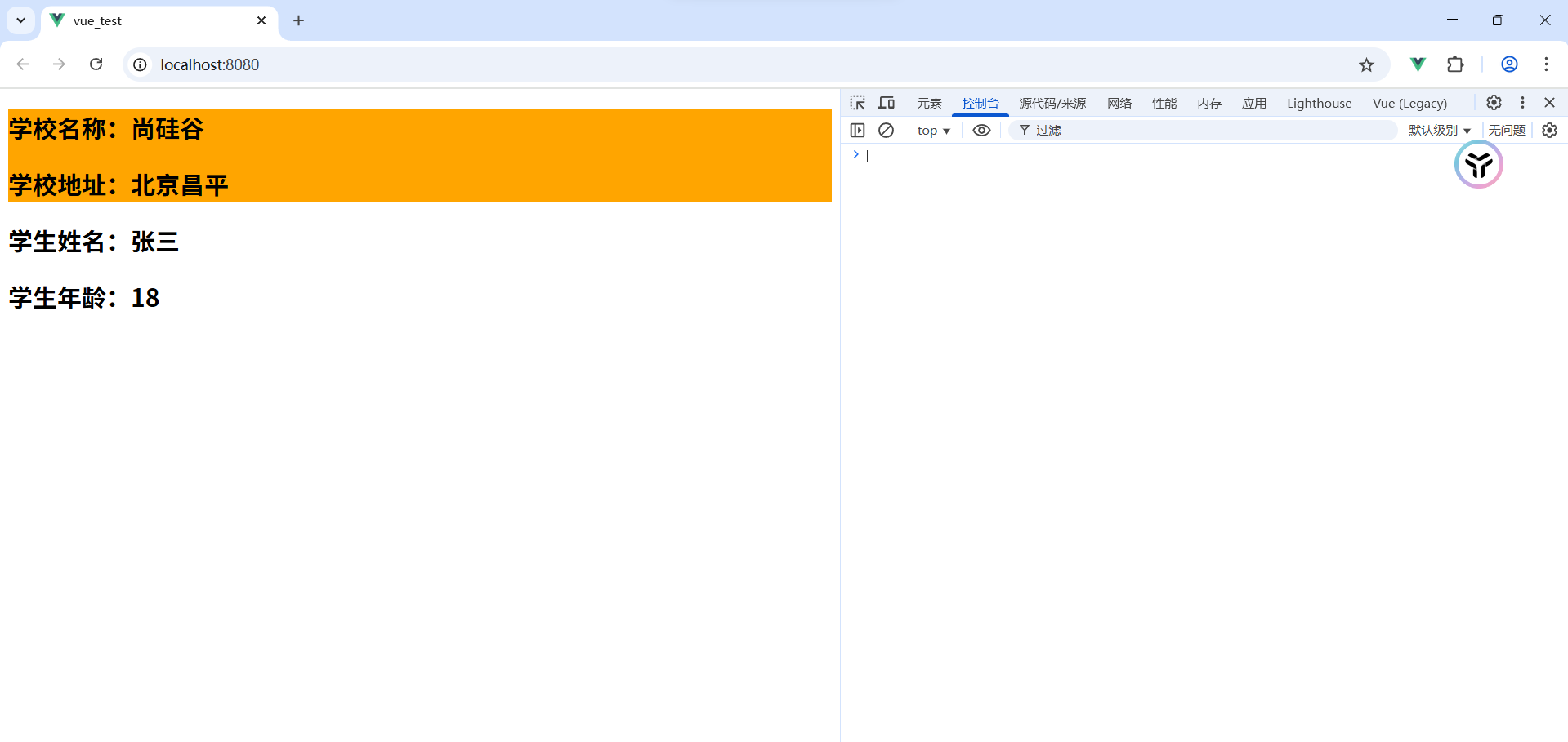
完善单文件操作
我们在上一篇文章留了个坑,现在补上。也就是单文件操作的最终使用。
我们将School和Student放入Components,
然后将组件引入app.vue
<template>
  <div id="app">
    <School></School>
    <Student></Student>
  </div>
</template>

<script>
import  School  from "./components/School";
import  Student  from "./components/Student";

export default {
  name: 'App',
  components: {
    School,
    Student
  }
}
</script>

<style>
/* #app {
  font-family: Avenir, Helvetica, Arial, sans-serif;
  -webkit-font-smoothing: antialiased;
  -moz-osx-font-smoothing: grayscale;
  text-align: center;
  color: #2c3e50;
  margin-top: 60px;
} */
</style>
成功显示
main.js中的render
render: h => h(App) 是 Vue.js 中的一个常见写法,通常用于定义一个 Vue 应用的根组件渲染函数。以下是对它的详细解释:
1.render: h => h(App)的含义
render: h => h(App) 是一个简化的渲染函数,使用了箭头函数语法。它的作用是将一个组件(App)渲染到 Vue 应用的根节点中。
h:这是渲染函数的参数,是一个函数,用于创建虚拟 DOM 节点。App:这是一个 Vue 组件,通常是应用的根组件。h(App):调用h函数,传入App组件作为参数,表示创建一个App组件的虚拟 DOM 节点。render: h => h(App):定义了一个渲染函数,返回 App 组件的虚拟 DOM 节点。
2.等价的写法
render: h => h(App) 是一个简化的写法,等价于以下代码:
new Vue({
  render: function(h) {
    return h(App);
  }
}).$mount('#app');
这两种写法在功能上是完全相同的,只是语法上略有不同。箭头函数写法更简洁,适合在简单场景下使用。
ref属性
1. 被用来给元素或子组件注册引用信息(id的替代者)
2. 应用在html标签上获取的是真实DOM元素,应用在组件标签上是组件实例对象(vc)
3. 使用方式:
1. 打标识:```<h1 ref="xxx">.....</h1>``` 或 ```<School ref="xxx"></School>```
2. 获取:```this.$refs.xxx```
实例
<template>
	<div>
		<h1 v-text="msg" ref="title"></h1>
		<button ref="btn" @click="showDOM">点我输出上方的DOM元素</button>
		<School ref="sch"/>
	</div>
</template>

<script>
	//引入School组件
	import School from './components/School'

	export default {
		name:'App',
		components:{School},
		data() {
			return {
				msg:'欢迎学习Vue!'
			}
		},
		methods: {
			showDOM(){
				console.log(this.$refs.title) //真实DOM元素
				console.log(this.$refs.btn) //真实DOM元素
				console.log(this.$refs.sch) //School组件的实例对象(vc)
			}
		},
	}
</script>
props配置项
注意!!!
props的属性是不可以被修改的
1. 功能:让组件接收外部传过来的数据,通常是由父组件给子组件传数据
2. 传递数据:```<Demo name="xxx"/>```
3. 接收数据:
1. 第一种方式(只接收):```props:['name'] ```
2. 第二种方式(限制类型):```props:{name:String}```
3. 第三种方式(限制类型、限制必要性、指定默认值):
        props:{
         name:{
         type:String, //类型
         required:true, //必要性
         default:'老王' //默认值
         }
        }
备注:props是只读的,Vue底层会监测你对props的修改,如果进行了修改,就会发出警告,若业务需求确实需要修改,那么请复制props的内容到data中一份,然后去修改data中的数据。
实例
app.vue
<template>
	<div>
		<Student name="李四" sex="女" :age="18"/>
	</div>
</template>

<script>
	import Student from './components/Student'

	export default {
		name:'App',
		components:{Student}
	}
</script>
student.vue
<template>
	<div>
		<h1>{{msg}}</h1>
		<h2>学生姓名:{{name}}</h2>
		<h2>学生性别:{{sex}}</h2>
		<h2>学生年龄:{{myAge+1}}</h2>
		<button @click="updateAge">尝试修改收到的年龄</button>
	</div>
</template>

<script>
	export default {
		name:'Student',
		data() {
			console.log(this)
			return {
				msg:'我是一个尚硅谷的学生',
				myAge:this.age
			}
		},
		methods: {
			updateAge(){
				this.myAge++
			}
		},
		//简单声明接收
		// props:['name','age','sex']

		//接收的同时对数据进行类型限制
		/* props:{
			name:String,
			age:Number,
			sex:String
		} */

		//接收的同时对数据:进行类型限制+默认值的指定+必要性的限制
		props:{
			name:{
				type:String, //name的类型是字符串
				required:true, //name是必要的
			},
			age:{
				type:Number,
				default:99 //默认值
			},
			sex:{
				type:String,
				required:true
			}
		}
	}
</script>
emit
1.什么是emit?
emit 是 Vue.js 中用于子组件向父组件传递数据和事件的核心工具。它允许子组件通过触发自定义事件将数据或通知传递给父组件,从而实现父子组件之间的通信。
2.emit的基本语法
在子组件中,使用 this.$emit 方法触发一个自定义事件,并可以传递数据:
this.$emit('event-name', data);event-name:自定义事件的名称,必须与父组件中监听的事件名称一致。data:可选参数,用于传递给父组件的数据,可以是任何类型(如字符串、数字、对象等)。
3.emit的使用场景
子组件通知父组件发生了某些行为(如按钮点击)。
子组件向父组件传递数据(如表单输入的值)。
父组件响应子组件的行为或数据。
实例
子组件代码
const nextPage = () => {
  if (props.currentPage < totalPages.value)
    emit("update:currentPage", props.currentPage + 1);
};
父组件代码
<PaginationComponent
  @update:currentPage="updateCurrentPage"
/>
const updateCurrentPage = (page) => {
  currentPage.value = page;
};
详细解析
1.子组件触发事件
假设用户点击了“下一页”按钮,调用了 nextPage 方法
调用
emit方法,触发update:currentPage事件。传递新的页码值
props.currentPage + 1给父组件。
2.父组件监听事件
父组件通过 @update:currentPage="updateCurrentPage" 监听子组件触发的事件
@update:currentPage是监听子组件触发的update:currentPage事件。当子组件触发这个事件时,调用父组件中的 updateCurrentPage 方法。
3.父组件处理事件
父组件中的 updateCurrentPage 方法被调用
接收子组件传递的新页码值
page。更新父组件中的
currentPage的值为page。
插槽
在 Vue.js 中,插槽(Slot) 是一个非常强大的功能,用于在组件之间实现内容的分发和自定义。插槽允许父组件向子组件传递自定义的内容,从而提高组件的灵活性和可复用性。
1.插槽的基本概念
插槽允许你在组件的模板中定义一个或多个“占位符”,这些占位符可以被父组件替换为自定义的内容。这样,子组件可以专注于布局和样式,而父组件可以决定具体的内容。
2.插槽的类型
Vue.js 提供了三种类型的插槽:
默认插槽(Default Slot)
具名插槽(Named Slot)
作用域插槽(Scoped Slot)
3.默认插槽(Default Slot)
默认插槽是最简单的插槽类型,它允许父组件向子组件传递任意内容。
子组件
<template>
  <div class="card">
    <slot>默认内容</slot>
  </div>
</template>
父组件
<template>
<div>
<Card>
<p>这是自定义内容</p>
</Card>
</div>
</template>
<script>
import Card from './Card.vue';
export default {
components: {
Card
}
};
</script>在这个例子中:
子组件
Card定义了一个默认插槽<slot>默认内容</slot>。父组件通过
<Card>标签的子内容<p>这是自定义内容</p>替换了默认插槽的内容。如果父组件没有提供内容,则显示默认内容。
4.具名插槽(Named Slot)(用的多)
具名插槽允许你在子组件中定义多个插槽,并通过名字来区分它们。这使得父组件可以更灵活地控制内容的分布。
子组件
<template>
  <div class="container">
    <header>
      <slot name="header">默认头部内容</slot>
    </header>
    <main>
      <slot>默认主体内容</slot>
    </main>
    <footer>
      <slot name="footer">默认底部内容</slot>
    </footer>
  </div>
</template>
父组件
<template>
<div>
<Layout>
<template #header>
<h1>这是自定义头部</h1>
</template>
<p>这是主体内容</p>
<template #footer>
<p>这是自定义底部</p>
</template>
</Layout>
</div>
</template>
<script>
import Layout from './Layout.vue';
export default {
components: {
Layout
}
};
</script>在这个例子中:
子组件
Layout定义了三个具名插槽:header、默认插槽和footer。父组件通过
<template #header>和<template #footer>指定了自定义的头部和底部内容。默认插槽的内容直接写在
<Layout>标签内。
5.作用域插槽(Scoped Slot)
作用域插槽允许子组件向父组件传递数据,父组件可以在插槽内容中使用这些数据。这使得父组件可以访问子组件的内部数据,同时保持子组件的封装性。
子组件
<template>
<div class="list">
<ul>
<li v-for="item in items" :key="item.id">
<slot :item="item">默认内容</slot>
</li>
</ul>
</div>
</template>
<script>
export default {
data() {
return {
items: [
{ id: 1, name: 'Item 1' },
{ id: 2, name: 'Item 2' },
{ id: 3, name: 'Item 3' }
]
};
}
};
</script>父组件
<template>
<div>
<ItemList>
<template #default="{ item }">
<p>{{ item.name }}</p>
</template>
</ItemList>
</div>
</template>
<script>
import ItemList from './ItemList.vue';
export default {
components: {
ItemList
}
};
</script>在这个例子中:
子组件
ItemList定义了一个作用域插槽<slot :item="item">默认内容</slot>,并向父组件传递了item数据。父组件通过
<template #default="{ item }">捕获了子组件传递的数据,并在插槽内容中使用了item.name。
6.插槽的默认内容
如果你希望插槽在父组件没有提供内容时显示默认内容,可以在子组件中定义默认内容。
子组件
<template>
  <div>
    <slot>这是默认内容</slot>
  </div>
</template>
父组件
<template>
<div>
<SlotComponent />
</div>
</template>
<script>
import SlotComponent from './SlotComponent.vue';
export default {
components: {
SlotComponent
}
};
</script>在这个例子中:
子组件
SlotComponent定义了一个默认插槽,并提供了默认内容。父组件没有提供内容,因此显示默认内容。
7. ElementUI里面的插槽使用
Element Plus 的 el-tooltip 组件可以实现悬浮框(tooltip)功能。el-tooltip 组件内部可以使用插槽来实现内容的分发。
1.el-tooltip的插槽用法
el-tooltip 是一个基于 Vue 的悬浮框组件,它提供了两个主要的插槽:
默认插槽:用于定义触发悬浮框显示的元素。
具名插槽
#content:用于定义悬浮框的内容。
示例代码中的插槽使用
<el-tooltip
  class="product-item product-content"
  effect="dark"
  placement="top"
  :open-delay="0"
  transition="none"
  popper-class="searchBodyProductToolTip"
  :popper-options="{ strategy: 'fixed' }"
>
  <template #content>
    <div class="tooltip-body-product">
      <span class="tooltip-title instruction-info">指令信息</span>
      <button
        class="copy-body-product-button"
        @click="copyProductTooltipContent(row)"
      >
        复制
      </button>
      <div class="tooltip-item">
        <span class="tooltip-label">推广的产品和服务</span>
        <span class="colon">:</span>
        <span class="tooltip-value"> {{ row.name }}</span>
      </div>
      <div class="tooltip-item">
        <span class="tooltip-label">关键词</span>
        <span class="colon">:</span>
        <span class="tooltip-value">{{ row.keyWord }}</span>
      </div>
      <div class="tooltip-item">
        <span class="tooltip-label">生成的语言</span>
        <span class="colon">:</span>
        <span class="tooltip-value">{{ row.language }}</span>
      </div>
      <div class="tooltip-item">
        <span class="tooltip-label">广告活动目标</span>
        <span class="colon">:</span>
        <span class="tooltip-value">{{
          row.campaign.join("、")
        }}</span>
      </div>
    </div>
  </template>
  <td class="body-product">
    <span>{{ row.name }}</span>
  </td>
</el-tooltip>
在这个例子中:
默认插槽:
<td class="body-product">是触发悬浮框显示的元素。具名插槽 #content:定义了悬浮框的内容,包括标题、复制按钮和多个信息项。
2.插槽的作用
默认插槽:定义了触发悬浮框显示的元素。用户交互(如鼠标悬停)时,会显示悬浮框。
具名插槽
#content:定义了悬浮框的内容。你可以在这里放置任何自定义的内容,如文本、按钮、列表等。
总结
到此这篇关于前端Vue2使用脚手架的文章就介绍到这了,更多相关前端Vue2使用脚手架内容请搜索脚本之家以前的文章或继续浏览下面的相关文章希望大家以后多多支持脚本之家!