
Vue实现液态玻璃登录卡片的效果示例
作者:w_omit
本文主要介绍了Vue实现液态玻璃登录卡片,包括多层叠加、SVG滤镜、3D倾斜交互等技术,文中通过示例代码介绍的非常详细,对大家的学习或者工作具有一定的参考学习价值,需要的朋友们下面随着小编来一起学习学习吧
效果介绍
液态玻璃(Liquid Glass)是一种极具现代感的UI视觉风格,常见于高端网站和操作系统界面。它通过多层叠加、模糊、光泽、滤镜等技术,模拟出玻璃的通透、折射和高光质感。苹果的这次系统设计更新,带火了这一设计效果,本教程将带你一步步实现一个带有3D灵动倾斜交互的液态玻璃登录卡片。
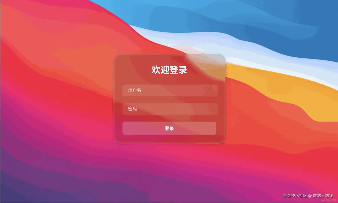
实际效果:
技术原理解析
1. 多层叠加
液态玻璃效果的核心是多层视觉叠加:
- 模糊层(blur):让背景内容变得虚化,产生玻璃的通透感。
- 色调层(tint):为玻璃加上一层淡淡的色彩,提升质感。
- 高光层(shine):模拟玻璃边缘的高光和内阴影,增强立体感。
- SVG滤镜:通过 SVG 的
feTurbulence和feDisplacementMap,让玻璃表面产生微妙的扭曲和流动感。
2. 3D灵动倾斜
通过监听鼠标在卡片上的移动,动态计算并设置 transform: perspective(...) rotateX(...) rotateY(...),让卡片随鼠标灵动倾斜,增强交互体验。
3. 背景与环境
背景可以是渐变色,也可以是图片。玻璃卡片通过 backdrop-filter 与背景内容产生交互,形成真实的玻璃质感。
实现步骤详解
1. 结构搭建
<template>
  <div class="login-container animated-background">
    <!-- SVG滤镜库 -->
    <svg style="display: none">...</svg>
    <!-- 登录卡片 -->
    <div
      class="glass-component login-card"
      ref="tiltCard"
      @mousemove="handleMouseMove"
      @mouseleave="handleMouseLeave"
    >
      <div class="glass-effect"></div>
      <div class="glass-tint"></div>
      <div class="glass-shine"></div>
      <div class="glass-content">
        <!-- 登录表单内容 -->
      </div>
    </div>
  </div>
</template>
2. SVG滤镜实现液态扭曲
<svg style="display: none">
  <filter id="glass-distortion" x="0%" y="0%" width="100%" height="100%" filterUnits="objectBoundingBox">
    <feTurbulence type="fractalNoise" baseFrequency="0.001 0.005" numOctaves="1" seed="17" result="turbulence" />
    <feComponentTransfer in="turbulence" result="mapped">
      <feFuncR type="gamma" amplitude="1" exponent="10" offset="0.5" />
      <feFuncG type="gamma" amplitude="0" exponent="1" offset="0" />
      <feFuncB type="gamma" amplitude="0" exponent="1" offset="0.5" />
    </feComponentTransfer>
    <feGaussianBlur in="turbulence" stdDeviation="3" result="softMap" />
    <feSpecularLighting in="softMap" aceScale="5" specularConstant="1" specularExponent="100" lighting-color="white" result="specLight">
      <fePointLight x="-200" y="-200" z="300" />
    </feSpecularLighting>
    <feComposite in="specLight" operator="arithmetic" k1="0" k2="1" k3="1" k4="0" result="litImage" />
    <feDisplacementMap in="SourceGraphic" in2="softMap" scale="200" xChannelSelector="R" yChannelSelector="G" />
  </filter>
</svg>- 这段 SVG 代码必须放在页面结构内,供 CSS filter 调用。
3. 背景设置
.animated-background {
  width: 100vw;
  height: 100vh;
  background-image: url('你的背景图片路径');
  background-size: cover;
  background-position: center;
  background-repeat: no-repeat;
  position: fixed;
  top: 0;
  left: 0;
  z-index: -1;
}- 建议用高质量渐变或壁纸,能更好衬托玻璃质感。
4. 卡片多层玻璃结构
.login-card {
  width: 400px;
  border-radius: 24px;
  overflow: hidden;
  box-shadow: 0 4px 24px 0 rgba(0,0,0,0.10), 0 1.5px 6px 0 rgba(0,0,0,0.08);
  background: transparent;
  position: relative;
}
.glass-effect {
  position: absolute;
  inset: 0;
  z-index: 0;
  backdrop-filter: blur(5px);
  filter: url(#glass-distortion);
  isolation: isolate;
  border-radius: 24px;
}
.glass-tint {
  position: absolute;
  inset: 0;
  z-index: 1;
  background: rgba(0, 0, 0, 0.15);
  border-radius: 24px;
}
.glass-shine {
  position: absolute;
  inset: 0;
  z-index: 2;
  border: 1px solid rgba(255, 255, 255, 0.13);
  border-radius: 24px;
  box-shadow:
    inset 1px 1px 8px 0 rgba(255, 255, 255, 0.18),
    inset -1px -1px 8px 0 rgba(255, 255, 255, 0.08);
  pointer-events: none;
}
.glass-content {
  position: relative;
  z-index: 3;
  padding: 2rem;
  color: white;
}- 每一层都要有一致的 border-radius,才能保证圆角处无割裂。
5. 3D灵动倾斜交互
methods: {
  handleMouseMove (e) {
    const card = this.$refs.tiltCard
    const rect = card.getBoundingClientRect()
    const x = e.clientX - rect.left
    const y = e.clientY - rect.top
    const centerX = rect.width / 2
    const centerY = rect.height / 2
    const maxTilt = 18
    const rotateY = ((x - centerX) / centerX) * maxTilt
    const rotateX = -((y - centerY) / centerY) * maxTilt
    card.style.transform = `perspective(600px) rotateX(${rotateX}deg) rotateY(${rotateY}deg) scale(1.03)`
  },
  handleMouseLeave () {
    const card = this.$refs.tiltCard
    card.style.transform = 'perspective(600px) rotateX(0deg) rotateY(0deg) scale(1)'
  }
}- 鼠标移动时,卡片会根据指针位置灵动倾斜。
- 鼠标移出时,卡片平滑恢复。
6. 细节优化
- 阴影柔和:避免黑色边缘过重,提升高级感。
- 高光线条:用低透明度白色边框和内阴影,模拟玻璃高光。
- 所有层的圆角一致:防止割裂。
- 表单输入框:用半透明背景和模糊,保持整体风格统一。
7.完整代码
<template>
  <div class="login-container animated-background">
    <!-- SVG滤镜库 -->
    <svg style="display: none">
      <filter id="glass-distortion" x="0%" y="0%" width="100%" height="100%" filterUnits="objectBoundingBox">
        <feTurbulence type="fractalNoise" baseFrequency="0.001 0.005" numOctaves="1" seed="17" result="turbulence" />
        <feComponentTransfer in="turbulence" result="mapped">
          <feFuncR type="gamma" amplitude="1" exponent="10" offset="0.5" />
          <feFuncG type="gamma" amplitude="0" exponent="1" offset="0" />
          <feFuncB type="gamma" amplitude="0" exponent="1" offset="0.5" />
        </feComponentTransfer>
        <feGaussianBlur in="turbulence" stdDeviation="3" result="softMap" />
        <feSpecularLighting in="softMap" aceScale="5" specularConstant="1" specularExponent="100" lighting-color="white" result="specLight">
          <fePointLight x="-200" y="-200" z="300" />
        </feSpecularLighting>
        <feComposite in="specLight" operator="arithmetic" k1="0" k2="1" k3="1" k4="0" result="litImage" />
        <feDisplacementMap in="SourceGraphic" in2="softMap" scale="200" xChannelSelector="R" yChannelSelector="G" />
      </filter>
    </svg>

    <!-- 登录卡片 -->
    <div
      class="glass-component login-card"
      ref="tiltCard"
      @mousemove="handleMouseMove"
      @mouseleave="handleMouseLeave"
    >
      <div class="glass-effect"></div>
      <div class="glass-tint"></div>
      <div class="glass-shine"></div>
      <div class="glass-content">
        <h2 class="login-title">欢迎登录</h2>
        <form class="login-form">
          <div class="form-group">
            <input type="text" placeholder="用户名" class="glass-input">
          </div>
          <div class="form-group">
            <input type="password" placeholder="密码" class="glass-input">
          </div>
          <button type="submit" class="glass-button">登录</button>
        </form>
      </div>
    </div>
  </div>
</template>

<script>
export default {
  name: 'LiquidGlass',
  data () {
    return {
      // 可以添加需要的数据
    }
  },
  methods: {
    handleMouseMove (e) {
      const card = this.$refs.tiltCard
      const rect = card.getBoundingClientRect()
      const x = e.clientX - rect.left
      const y = e.clientY - rect.top
      const centerX = rect.width / 2
      const centerY = rect.height / 2
      // 最大旋转角度
      const maxTilt = 18
      const rotateY = ((x - centerX) / centerX) * maxTilt
      const rotateX = -((y - centerY) / centerY) * maxTilt
      card.style.transform = `perspective(600px) rotateX(${rotateX}deg) rotateY(${rotateY}deg) scale(1.03)`
    },
    handleMouseLeave () {
      const card = this.$refs.tiltCard
      card.style.transform = 'perspective(600px) rotateX(0deg) rotateY(0deg) scale(1)'
    }
  }
}
</script>

<style lang="scss" scoped>
.login-container {
  min-height: 100vh;
  display: flex;
  align-items: center;
  justify-content: center;
  position: relative;
  overflow: hidden;
}

.animated-background {
  width: 100%;
  height: 100%;
  background-image: url('../../assets/macwallpaper.jpg');
  background-size: cover;
  background-position: center;
  background-repeat: no-repeat;
}

.login-card {
  width: 400px;
  position: relative;
  border-radius: 24px;
  overflow: hidden;
  box-shadow: 0 4px 24px 0 rgba(0,0,0,0.10), 0 1.5px 6px 0 rgba(0,0,0,0.08);
  transition: all 0.4s cubic-bezier(0.175, 0.885, 0.32, 1.6);
  cursor: pointer;
  background: transparent;
}

.glass-effect {
  position: absolute;
  inset: 0;
  z-index: 0;
  backdrop-filter: blur(5px);
  filter: url(#glass-distortion);
  isolation: isolate;
  border-radius: 24px;
}

.glass-tint {
  position: absolute;
  inset: 0;
  z-index: 1;
  background: rgba(0, 0, 0, 0.15);
  border-radius: 24px;
}

.glass-shine {
  position: absolute;
  inset: 0;
  z-index: 2;
  border: 1px solid rgba(255, 255, 255, 0.13);
  border-radius: 24px;
  box-shadow:
    inset 1px 1px 8px 0 rgba(255, 255, 255, 0.18),
    inset -1px -1px 8px 0 rgba(255, 255, 255, 0.08);
  pointer-events: none;
}

.glass-content {
  position: relative;
  z-index: 3;
  padding: 2rem;
  color: white;
}

.login-title {
  text-align: center;
  color: #fff;
  margin-bottom: 2rem;
  font-size: 2rem;
  font-weight: 600;
  text-shadow: 0 1px 3px rgba(0,0,0,0.2);
}

.form-group {
  margin-bottom: 1.5rem;
}

.glass-input {
  width: 90%;
  padding: 12px 20px;
  border: none;
  border-radius: 10px;
  background: rgba(255, 255, 255, 0.1);
  color: #fff;
  font-size: 1rem;
  backdrop-filter: blur(5px);
  transition: all 0.3s ease;

  &::placeholder {
    color: rgba(255, 255, 255, 0.7);
  }

  &:focus {
    outline: none;
    background: rgba(255, 255, 255, 0.2);
    box-shadow: 0 0 15px rgba(255, 255, 255, 0.1);
  }
}

.glass-button {
  width: 100%;
  padding: 12px;
  border: none;
  border-radius: 10px;
  background: rgba(255, 255, 255, 0.2);
  color: #fff;
  font-size: 1rem;
  font-weight: 600;
  cursor: pointer;
  transition: all 0.3s ease;
  backdrop-filter: blur(5px);
  position: relative;
  overflow: hidden;

  &:hover {
    background: rgba(255, 255, 255, 0.3);
    transform: translateY(-2px);
    box-shadow: 0 8px 25px rgba(0, 0, 0, 0.2);
  }

  &:active {
    transform: translateY(0);
  }
}

// 添加点击波纹效果
.click-gradient {
  position: absolute;
  border-radius: 50%;
  background: radial-gradient(circle, rgba(255,255,255,0.4) 0%, rgba(180,180,255,0.2) 40%, rgba(100,100,255,0.1) 70%, rgba(50,50,255,0) 100%);
  transform: translate(-50%, -50%) scale(0);
  opacity: 0;
  pointer-events: none;
  z-index: 4;
}

.glass-component.clicked .click-gradient {
  animation: gradient-ripple 0.6s ease-out;
}

@keyframes gradient-ripple {
  0% {
    transform: translate(-50%, -50%) scale(0);
    opacity: 1;
  }
  100% {
    transform: translate(-50%, -50%) scale(3);
    opacity: 0;
  }
}

.glass-component {
  transition: transform 0.25s cubic-bezier(0.22, 1, 0.36, 1);
  will-change: transform;
}
</style>
常见问题与优化建议
- 阴影过重/黑边:减小 box-shadow 的透明度和模糊半径。
- 圆角割裂:所有玻璃层都要加 border-radius。
- 背景不通透:确保 glass-effect 层有 blur 和 SVG filter。
- 性能问题:backdrop-filter 在低端设备上可能有性能损耗,建议只在必要区域使用。
- 浏览器兼容性:backdrop-filter 需现代浏览器支持,IE/部分安卓浏览器不兼容。
技术要点总结
- SVG滤镜:让玻璃表面有微妙的流动和扭曲感。
- backdrop-filter: blur:实现背景虚化。
- 多层叠加:色调、高光、阴影共同营造真实玻璃质感。
- 3D transform:提升交互体验。
- 细节打磨:阴影、边框、圆角、色彩都要精细调整。
结语
液态玻璃效果是现代前端视觉的代表之一。只要理解其原理,分层实现、细致调优,任何人都能做出媲美 macOS、Win11 的高端玻璃UI。希望本教程能帮助你掌握这项技术,做出属于自己的酷炫界面!
到此这篇关于Vue实现一个“液态玻璃”效果登录卡片的文章就介绍到这了,更多相关Vue实现液态玻璃登录卡片内容请搜索脚本之家以前的文章或继续浏览下面的相关文章希望大家以后多多支持脚本之家!