
如何封装一个可用js直接调用的弹窗组件
作者:wyfgoodgoodstudy
前言
在Vue开发中,正常的组件通常以模板方式调用,但对于弹窗这种呈现方式,使用模板的方式开发过于繁琐,怎样才能让弹窗组件可以像原生alert()一样通过函数调用触发弹窗呢?本文将基于Vue2,详细讲解如何封装一个可通过JavaScript函数直接调用的弹窗组件,实现高复用性和开发效率的提升。
一、开发思路
1. 先封装一个正常的弹窗组件
2. 使用Vue.extend动态构造组件实例,并挂载到新创建的DOM节点
3. 需要支持Promise的方式捕获确定和取消操作,同时支持确定按钮异步关闭。比如点确定后调个接口,接口返回处理后,再让弹窗关闭。
二、开发过程
1.封装弹窗组件
代码如下:
<template>
  <div class="my-dialog-container" v-if="visible" :style="{ 'z-index': zIndex }">
    <div class="mask" v-if="showMask" :style="{ 'z-index': zIndex + 1 }"></div>
    <div class="my-dialog-bg" @click="clickMask" :style="{ 'z-index': zIndex + 2 }">
      <div
        class="my-dialog"
        :style="{ width: width ? width : '60%' }"
        @click.stop="clickDialog"
      >
        <!-- 这里添加一个stop的事件,在点击弹窗区域时,阻止向上冒泡触发clickMask,把弹窗关掉了 -->
        <div class="dialog-header">
          <div class="dialog-title">{{ title }}</div>
          <div class="close-btn" v-if="showClose" @click="doClose">
            <i class="el-icon-close"></i>
          </div>
        </div>
        <div class="dialog-content" v-if="content">
          <div class="dialog-type-icon" v-if="type">
            <i
              class="el-icon-warning"
              style="color: #e6a23c"
              v-if="type == 'warning'"
            ></i>
            <i class="el-icon-error" style="color: #f56c6c" v-if="type == 'danger'"></i>
            <i class="el-icon-info" style="color: #909399" v-if="type == 'info'"></i>
            <i
              class="el-icon-success"
              style="color: #67c23a"
              v-if="type == 'success'"
            ></i>
          </div>
          <div class="dialog-context" v-html="content"></div>
        </div>
        <div class="dialoag-footer" v-if="showCancelButton || showConfirmButton">
          <el-button v-if="showCancelButton" size="small" @click="doCancel">{{
            cancelButtonName
          }}</el-button>
          <el-button
            type="primary"
            v-if="showConfirmButton"
            size="small"
            style="margin-right: 10px"
            @click="doConfirm"
            >{{ confirmButtonName }}</el-button
          >
        </div>
      </div>
    </div>
  </div>
</template>
<script>
import Vue from "vue";
export default {
  created() {
    this.zIndex = Vue.dialogZIndex;
  },
  props: {
    visible: {
      type: Boolean,
      isRequired: true,
    },
    title: {
      type: String,
      default: "提示",
    },
    content: {
      type: String,
    },
    showMask: {
      // 是否显示遮罩
      type: Boolean,
      default: true,
    },
    clickMaskClose: {
      // 点击遮罩是否关闭弹窗
      type: Boolean,
      default: true,
    },
    showCancelButton: {
      type: Boolean,
      default: true,
    },
    cancelButtonName: {
      type: String,
      default: "取消",
    },
    showConfirmButton: {
      type: Boolean,
      default: true,
    },
    confirmButtonName: {
      type: String,
      default: "确定",
    },
    showClose: {
      // 是否显示右上角关闭按钮
      type: Boolean,
      default: true,
    },
    width: {
      // 弹窗占屏幕宽度,默认60%
      type: String,
      default: "60%",
    },
    type: {
      // 提示类型,文案前的图标会有所不同 success  warning  info  danger
      type: String,
    },
    beforeClose: {
      type: Function,
      default: (action, instance, done) => {},
    },
  },
  data() {
    return {
      zIndex: 1000,
    };
  },
  methods: {
    clickMask() {
      if (this.clickMaskClose && this.showMask) {
        this.beforeClose("close", this, this.done("close"));
      }
    },
    clickDialog() {},
    doCancel() {
      this.beforeClose("cancel", this, this.done("cancel"));
    },
    doConfirm() {
      this.beforeClose("confirm", this, this.done("confirm"));
    },
    doCloseBtn() {
      this.beforeClose("close", this, this.done("close"));
    },
    doClose() {
      this.visible = false;
    },
    done(action) {
      const fn = () => {
        if (action == "confirm") {
          this.$emit("confirm");
        } else if (action == "cancel") {
          this.$emit("cancel");
        }
        this.doClose();
      };
      return fn;
    },
  },
};
</script>
<style scoped lang="less">
.my-dialog-container {
  position: fixed;
  top: 0;
  bottom: 0;
  left: 0;
  right: 0;
  .mask {
    position: fixed;
    top: 0;
    bottom: 0;
    left: 0;
    right: 0;
    background: #000;
    opacity: 0.5;
  }
  .my-dialog-bg {
    position: fixed;
    top: 0;
    bottom: 0;
    left: 0;
    right: 0;
    overflow-y: auto;
    .my-dialog {
      margin: 0 auto;
      background: #fff;
      max-height: 50vh;
      overflow-y: auto;
      margin-top: 30vh;
      border-radius: 8px;
      .dialog-header {
        display: flex;
        justify-content: space-between;
        align-items: center;
        height: 50px;
        .dialog-title {
          font-size: 18px;
          font-weight: bold;
          padding-left: 15px;
        }
        .close-btn {
          padding-right: 15px;
        }
      }
      .dialog-content {
        display: flex;
        text-align: left;
        padding: 10px 15px;
        font-size: 14px;
        align-items: center;
        .dialog-type-icon {
          font-size: 24px;
          padding-right: 10px;
        }
        .dialog-context {
        }
      }
      .dialoag-footer {
        display: flex;
        justify-content: flex-end;
        align-items: center;
        height: 50px;
      }
    }
  }
}
</style>
该组件提供了几个props
| 属性 | 字段名 | 是否必填 | 默认值 | 备注 |
|---|---|---|---|---|
弹窗显示状态 | visible | 是 | ||
| 弹窗标题 | title | "提示" | ||
| 内容 | content | 支持html和文本 | ||
| 是否显示遮罩 | showMask | true | ||
点击遮罩是否关闭弹窗 | clickMaskClose | true | ||
| 是否显示取消按钮 | showCancelButton | true | ||
| 取消按钮名称 | cancelButtonName | “取消” | ||
| 是否显示确定按钮 | showConfirmButton | true | ||
| 确定按钮名称 | confirmButtonName | “确定” | ||
是否显示右上角关闭按钮 | showClose | true | ||
| 弹窗占屏幕宽度比例 | width | 60% | 支持字符串形式的值,会直接赋给width样式 | |
| 弹窗类型 | type | 否 | success/warning/info/danger | |
| 关闭前回调 | beforeClose | (action, instance, done) => {} |
注意事项:
1. 弹窗、遮罩都是以fixed绝对定位,为了让新弹窗遮盖就弹窗,不显示到一个平面,所以z-index不能写死。
设置Vue的全局变量Vue.prototype.dialogZIndex,默认是1000,当创建新弹窗时,dialogZIndex + 3,新弹窗created生命周期函数中获取最新的dialogZIndex,使用动态样式的方式,设置给遮罩、弹窗体。
2. 由于有点击遮罩关闭弹窗的功能,为了避免点击弹窗事件冒泡到外层的遮罩,触发关闭弹窗的动作,给弹窗dom绑定一个点击事件,@click.stop="clickDialog",clickDialog是空方法,不处理。
3. 点击确定、取消、关闭、遮罩触发的关闭动作,都不直接修改visible属性,而是调用了this.beforeClose(),该方法的第三个参数是this.done的执行结果,可以看出,this.done返回了一个方法。当该方法执行时,会判断当前是何种方式触发的关闭,并做相应处理,然后关闭弹窗。这是实现异步关闭弹窗的关键。
2.封装js调用
代码如下:
// registerDialog.js
import Vue from "vue";
import MyDialog from "@/components/my-dialog.vue";

const DialogConstructor = Vue.extend(MyDialog);
const createModal = (options) => {
    return new Promise((resolve, reject) => {
        const instance = new DialogConstructor({
            propsData: {
                beforeClose: (action, ins, done) => {
                    done();
                },
                ...options,
            }
        });
        // 挂载到临时DOM
        const container = document.createElement('div')
        document.body.appendChild(container)
        instance.$mount(container);
        // 手动打开弹窗
        instance.visible = true
        // 监听关闭事件
        instance.$on('update:visible', (val) => {
            if (!val) {
                setTimeout(() => {
                    instance.$destroy();
                    document.body.removeChild(container)
                }, 300)
            }
        });
        instance.$on('confirm', resolve)
        instance.$on('cancel', reject)
    });
}

const registerDialog = () => {
    Vue.prototype.$myConfirm = (options) => {
        // 弹窗层级累加,保证先弹的框在下面
        if (!Vue.dialogZIndex) {
            Vue.dialogZIndex = 1000;
        } else {
            Vue.dialogZIndex = Vue.dialogZIndex + 3;
        }
        return createModal(options);
    }
}

export default registerDialog;
// main.js 添加这两句 import registerDialog from "@/components/registerDialog.js"; registerDialog();
在main.js中调用registerDialog方法,将js调用弹窗的方法$myConfirm,挂到Vue的原型对象上。
$myConfirm方法接受一个options对象,里面就是弹窗组件要求的props。调用该方法,首先修改Vue原型对象上的全局变量dialogZIndex,维护弹窗绝对定位的层级高度。然后调用了createModal方法,该方法会使用Vue.extend动态构造组件实例,并挂载到新创建的DOM节点,是整个实现的核心。
const DialogConstructor = Vue.extend(MyDialog);
registerDialog.js文件被main.js引用的时候,这句代码被执行了。
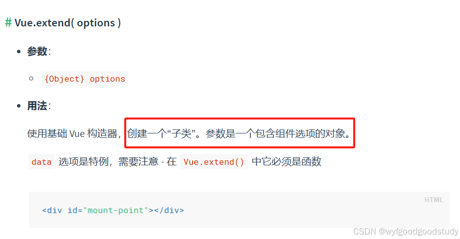
MyDialog是包含组件选项的对象,Vue.extend实际构建了弹窗组件的子类,该子类继承了弹窗组件所有的属性和方法。
createModal返回一个Promise,这是为了方便使用then和catch捕获到确定和取消的事件。
在该方法中,实例化了上面用Vue.extend创建的弹窗子类,存在变量instance中,通过propsData将用户参数传给组件,并提供beforeClose方法的默认值,不做异步处理,直接调用done方法往下。创建一个div,插入到body中,然后是用instance.$mount()方法将弹窗组件挂载到这个div中。并手动设置弹窗显示状态为true,此时弹窗已经打开。
另外,监听visible的值变化,当visible为false时,销毁当前弹窗实例,并从body中移除创建的div。
使用事件订阅监听到confirm和cancel事件,分别触发Promise的resolve和reject。
3.页面使用
代码示例
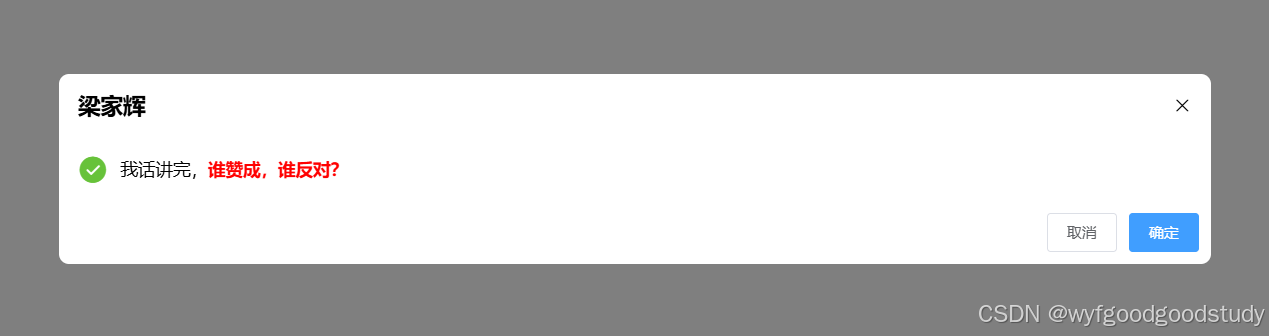
this.$myConfirm({
   title: "梁家辉",
   content: "<div>我话讲完,<strong style='color: red;'>谁赞成,谁反对?</strong></div>",
   type: "success",
   beforeClose: (action, instance, done) => {
      if (action == "confirm") {
         console.log("2秒后关闭");
         setTimeout(() => {
           done();
         }, 2000);
      } else {
         done();
      }
    },
}).then(() => {
   console.log("确认完毕");
}).catch(() => {
   console.log("取消完毕");
});
点击确定后,会先打印出“2秒后关闭”,等待两秒后关闭,点击取消或者关闭按钮,会直接关闭。
需要注意的是,如果要先异步处理,再关闭弹窗,要写在beforeClose中。如果是关闭弹窗后执行的逻辑,可以写在then或者catch中。
总结
到此这篇关于如何封装一个可用js直接调用的弹窗组件的文章就介绍到这了,更多相关js直接调用弹窗组件封装内容请搜索脚本之家以前的文章或继续浏览下面的相关文章希望大家以后多多支持脚本之家!