
基于Vue3+UniApp在单个页面实现固定TabBar的多种方式
作者:码农研究僧
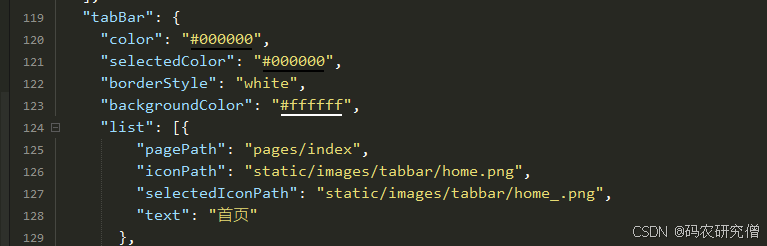
在 UniApp 开发中,tabBar 通常是通过 pages.json 配置的,适用于整个应用的全局导航
然而,在某些场景下,我们可能需要只在特定的页面展示 tabBar,而不会影响其他页面的布局。这就需要使用 自定义 tabBar,可以通过 view 组件、uni-segmented-control 组件或 uni-nav-bar 组件等方式来实现
以下是几种适用场景:
局部页面导航:
例如,一个订单管理页面,用户可以在 “进行中” 和 “已完成” 之间切换,而不影响全局 tabBar底部固定的二级导航:
例如,在 “记录” 页面,提供 “待审核” 和 “已审核” 选项,方便用户切换,而不会影响其他页面顶部导航栏的切换:
适用于不适合使用底部 tabBar 的场景,如数据管理页面,用户可以在 “待审核” 和 “已审核” 之间切换
| 方法 | 适用场景 | 说明 |
|---|---|---|
| 方法 1:自定义 view tabBar | 仅在某个页面底部 | 适用于特定页面,不会影响全局 tabBar |
| 方法 2:uni-segmented-control | 轻量级页面切换 | 适用于简单的 Tab 选项,不会影响布局 |
| 方法 3:uni-nav-bar | 顶部导航切换 | 适用于带顶部导航的 UI |
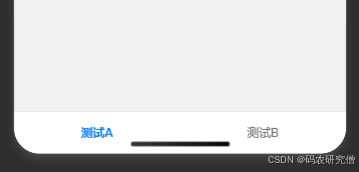
1. 自定义 view
<template>
  <view class="container">


    <!-- 固定底部的 tabBar -->
    <view class="fixed-tabbar">
      <view class="tab-item" :class="{ active: currentTab === 0 }" @click="currentTab = 0">
        <text>测试A</text>
      </view>
      <view class="tab-item" :class="{ active: currentTab === 1 }" @click="currentTab = 1">
        <text>测试B</text>
      </view>
    </view>
  </view>
</template>

<script>
export default {
  data() {
    return {
      currentTab: 0, // 当前选中的 tab
    };
  }
};
</script>

<style scoped>
.container {
  display: flex;
  flex-direction: column;
  height: 100vh;
}

.content {
  flex: 1;
  overflow-y: auto; /* 让内容可以滚动 */
  padding-bottom: 60px; /* 避免被底部 tabBar 遮挡 */
}

.fixed-tabbar {
  position: fixed;
  bottom: 0;
  left: 0;
  width: 100%;
  height: 50px;
  display: flex;
  justify-content: space-around;
  align-items: center;
  background-color: #fff;
  border-top: 1px solid #ddd;
}

.tab-item {
  flex: 1;
  text-align: center;
  padding: 10px;
  font-size: 14px;
  color: #666;
}

.tab-item.active {
  color: #007AFF;
  font-weight: bold;
}
</style>
截图如下:
fixed-tabbar 采用 position: fixed; bottom: 0;,始终固定在页面底部
使用 currentTab 变量控制当前选中的 tab,并根据 active 类名高亮
padding-bottom: 60px; 避免页面内容被 tabBar 遮挡
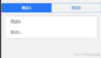
2. uni-segmented-control
以轻量级方式切换不同的页面内容,不需要固定的底部 tabBar
<template>
  <view>
    <!-- 顶部 Tab 切换 -->
    <uni-segmented-control
      :current="currentTab"
      :values="['测试A', '测试B']"
      @clickItem="switchTab"
    />

    <!-- 提柜记录 -->
    <view v-if="currentTab === 0">
      <uni-card title="测试A">
        <text>这里是测试A...</text>
      </uni-card>
    </view>

    <!-- 残损单记录 -->
    <view v-else>
      <uni-card title="测试B">
        <text>这里是测试B...</text>
      </uni-card>
    </view>
  </view>
</template>

<script>
export default {
  data() {
    return {
      currentTab: 0 // 默认选中第一个
    };
  },
  methods: {
    switchTab(index) {
      this.currentTab = index;
    }
  }
};
</script>
截图如下:
uni-segmented-control 提供顶部 tab,点击时 @clickItem 触发 switchTab 进行切换
仅 currentTab === 0 时展示
适用于无需固定底部导航栏的场景,如数据筛选切换
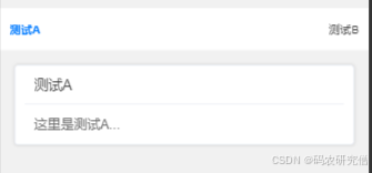
3. uni-nav-bar
顶部导航,在标题栏左右提供不同的 Tab 切换按钮
<template>
  <view>
    <!-- 自定义顶部 Tab -->
    <uni-nav-bar >
      <template v-slot:left>
        <view @click="switchTab(0)" :class="{ active: currentTab === 0 }">测试A</view>
      </template>
      <template v-slot:right>
        <view @click="switchTab(1)" :class="{ active: currentTab === 1 }">测试B</view>
      </template>
    </uni-nav-bar>

    <!-- 页面内容 -->
    <view v-if="currentTab === 0">
      <uni-card title="测试A">
        <text>这里是测试A...</text>
      </uni-card>
    </view>

    <view v-else>
      <uni-card title="测试B">
        <text>这里是测试B...</text>
      </uni-card>
    </view>
  </view>
</template>

<script>
export default {
  data() {
    return {
      currentTab: 0
    };
  },
  methods: {
    switchTab(index) {
      this.currentTab = index;
    }
  }
};
</script>

<style scoped>
.active {
  font-weight: bold;
  color: #007AFF;
}
</style>
uni-nav-bar 作为导航栏,在左右 slot 里添加点击切换的按钮。
switchTab 控制当前显示的内容
以上就是基于Vue3+UniApp在单个页面实现固定TabBar的多种方式的详细内容,更多关于Vue3 UniApp固定TabBar的资料请关注脚本之家其它相关文章!