
vue如何实现pc和移动端布局详细代码
作者:我是沐辰
1.核心点
- 本方案未采用同一套代码去响应各端的方式去开发,个人觉得兼容太麻烦、样式难以精确控制,遂采用 pc 和 移动端 两套代码、一套路由规则的方式去开发
- 本方案适用于官网类、展示类的项目
- 本方案在移动端中使用 vw 作为基本单位,使用 postcss-px-to-viewport 实现移动端 px 单位自动转为 vw
2.开撸
2.1 获取当前设备类型,共享给全局使用
- vuex 中定义名为 device 的 state,用于全局共享当前设备(pc || 移动)
export default new Vuex.Store({
  state: {
    device: 'pc'
  },
  mutations: {
    setDevice (state, data) {
      state.device = data
    }
  }
})- App.vue 中使用像素来检测当前所处设备
<template>
  <div id="app">
    <router-view />
  </div>
</template>
<script>
import { mapMutations } from 'vuex'
import { throttle } from 'lodash-es'
export default {
  created () {
    // resize节流
    this.resizeChange = throttle(this.resizeChange, 200)
    this.resizeChange()
    window.addEventListener('resize', this.resizeChange, false)
  },
  methods: {
    ...mapMutations(['setDevice']),
    resizeChange () {
      // 判断是否是 pc 或者 移动端,也可以用机型之类的条件来判断,个人觉得用像素更简单快捷
      // 默认设置当屏幕宽度 > 1000 时,为PC端
      if (document.documentElement.clientWidth > 1000) {
        this.setDevice('pc')
      } else {
        // 默认设置当屏幕宽度 <= 1000 时,为移动端
        this.setDevice('m')
      }
    }
  },
  destroyed () {
    window.removeEventListener('resize', this.resizeChange, false)
  }
}
</script>
到目前为止,我们可以通过 vuex 中的 device 拿到当前的设备类型,pc 对应的是 pc 端,m 对应的是移动端
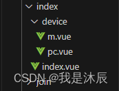
2.2 页面文件结构及关键代码
- 页面文件结构
- 代码

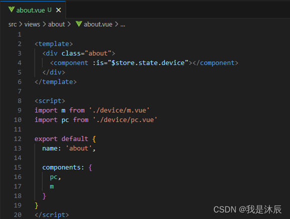
// index.vue
<template>
  <div class="index">
    <component :is="$store.state.device"></component>
  </div>
</template>
<script>
import m from './device/m.vue'
import pc from './device/pc.vue'
export default {
  name: 'index',
  components: {
    pc,
    m
  }
}
</script>
// device 目录下的 m.vue 或 pc.vue
// m.vue
<template>
<div class="index-m">
<p> 这里没有其他特殊之处,正常写 移动端 和 pc 端代码即可 </p>
<p> m.vue 和 pc.vue 没有本质差异,仅修改 类名 或 组件名称后缀为 -pc </p>
</div>
</template>
<script>
export default {
name: 'index-m'
}
</script>
<style lang="scss" scoped>
.index-m {
// 如果是 m.vue,这里正常使用 px 作为基本单位
}
</style>在首页 index.vue 中,将其所对应的 pc 端代码定义为 pc.vue,对应的 移动端 代码定义为 m.vue,并导入到 index.vue 中,分别命名为 pc 和 m,而后使用动态组件,并使用$store.state.device来控制当前所展示的页面为 pc端 还是 移动端。
2.3 使用 postcss-px-to-viewport 将项目中的 px 单位转换为 vw
截止到目前,我们已经实现了不同设备下(pc端 或 移动端)代码的按需展示,但是有一个问题亟待解决。
众所周知,移动端设备的屏幕大小不一、“千奇百怪”,如果继续使用 px 作为基本单位,最后呈现的效果必然不理想,经过对比,决定使用 vw 来作为移动端的基本单位。
但是我们都知道,一般情况下设计稿的尺寸是固定的 px 单位,在开发时需要将 px 单位转为 vw 来进行开发,但是这一过程略显繁琐,哪怕安装了 vs code 的单位转换插件依旧差强人意,这时,我们便可以请出 postcss-px-to-viewport 来帮我们解决这一问题。
作用
该插件可以让我们在写 css 代码的时候正常的使用 px,其会将 px 单位自动转换为视口单位 (vw, vh, vmin, vmax)安装
npm install postcss-px-to-viewport --save-dev
yarn add -D postcss-px-to-viewport
- 配置
// .postcssrc.js
module.exports = {
  plugins: {
      // 用来给不同的浏览器自动添加相应前缀,如-webkit-,-moz-等等
      autoprefixer: {},
      "postcss-px-to-viewport": {
        // 需要转换的单位,默认为"px"
        unitToConvert: 'px',
        viewportWidth: 375,
        // 单位转换后保留的精度
        unitPrecision: 3,
        // 能转化为vw的属性列表
        propList: [
          '*'
        ],
        // 希望使用的视口单位
        viewportUnit: 'vw',
        // 字体使用的视口单位
        fontViewportUnit: 'vw',
        // 设置最小的转换数值,如果为1的话,只有大于1的值会被转换
        minPixelValue: 1,
        // 仅转换的文件,这里不要使用 \/ 去匹配文件,不生效??
        // 这里还有一个坑,就是如果使用了 include 规则的话,正常的版本不生效,可以安装这个
        // "postcss-px-to-viewport": "github:evrone/postcss-px-to-viewport"
        include: [/device\\m.vue/]
      }
  }
};配置include: [/device\\m.vue/]使我们移动端代码中的 px 单位自动转换为 vw,而 pc 端的代码不受影响。
2.4 使用 node 自动创建符合需求的页面
2.4.1 创建脚本文件
- 根目录下创建 scripts 及其子文件
- template.js

module.exports = {
  viewTemplate: viewName => {
    return `
<template>
  <div class="${viewName}">
    <component :is="$store.state.device"></component>
  </div>
</template>
<script>
import m from './device/m.vue'
import pc from './device/pc.vue'
export default {
  name: '${viewName}',
  components: {
    pc,
    m
  }
}
</script>
`
  },
// 移动端 页面基本结构
  mTemplate: viewName => {
    return `
<template>
  <div class="${viewName}-m">
  </div>
</template>
<script>
export default {
  name: '${viewName}-m'
}
</script>
<style lang="scss" scoped>
.${viewName}-m {
}
</style>
`
  },
// pc端 页面基本结构
  pcTemplate: viewName => {
    return `
<template>
  <div class="${viewName}-pc">
  </div>
</template>
<script>
export default {
  name: '${viewName}-pc'
}
</script>
<style lang="scss" scoped>
.${viewName}-pc {
}
</style>
`
  }
}- generateView.js
// generateView.js
const chalk = require('chalk')
const path = require('path')
const fs = require('fs')
const log = message => console.log(chalk.green(`${message}`))
const successLog = message => console.log(chalk.blue(`${message}`))
const errorLog = error => console.log(chalk.red(`${error}`))
const { viewTemplate, mTemplate, pcTemplate } = require('./template')
const generateFile = (path, data) => {
  if (fs.existsSync(path)) {
    errorLog(`${path}文件已存在`)
    return
  }
  return new Promise((resolve, reject) => {
    fs.writeFile(path, data, 'utf8', err => {
      if (err) {
        errorLog(err.message)
        reject(err)
      } else {
        resolve(true)
      }
    })
  })
}
// 创建页面目录
const dotExistDirectoryCreate = (directory) => {
  return new Promise((resolve) => {
    mkdirs(directory, function () {
      resolve(true)
    })
  })
}
// 递归创建目录
const mkdirs = (directory, callback) => {
  var exists = fs.existsSync(directory)
  if (exists) {
    callback()
  } else {
    mkdirs(path.dirname(directory), function () {
      fs.mkdirSync(directory)
      callback()
    })
  }
}
// 获取页面名称
const getViewName = (viewPath) => {
  const arr = viewPath.split('\\')
  return arr[arr.length - 1]
}
log('请输入要生成的页面组件名称(无需添加.vue后缀)、支持深层目录解析(dirName/viewName)、页面将生成在 views/目录下')
let viewName = ''
process.stdin.on('data', async chunk => {
  const inputName = String(chunk).trim().toString()
  // Vue页面组件路径
  let viewPath = path.resolve(__dirname, '../src/views', inputName)
  viewName = getViewName(inputName)
  viewPath = path.resolve(viewPath, viewName + '.vue')
  const viewDirectory = path.dirname(viewPath)
  // 检查界面是否存在
  const hasViewExists = fs.existsSync(viewPath)
  if (hasViewExists) {
    errorLog(`${inputName}页面已存在,请重新输入`)
    return
  }
  try {
    // 1.生成页面目录
    log(`正在生成页面目录 ${viewDirectory}`)
    await dotExistDirectoryCreate(viewDirectory)
    // 2.生成页面子目录
    const sonViewDirectory = path.resolve(viewDirectory, './device')
    log(`正在生成页面子目录 ${sonViewDirectory}`)
    await dotExistDirectoryCreate(sonViewDirectory)
    // 3.生成 m.vue 页面
    const mViewPath = path.resolve(sonViewDirectory, './m.vue')
    log(`正在生成子目录子页面文件 ${mViewPath}`)
    await generateFile(mViewPath, mTemplate(viewName))
    // 4.生成 pc.vue 页面
    const pcViewPath = path.resolve(sonViewDirectory, './pc.vue')
    log(`正在生成子目录子页面文件 ${pcViewPath}`)
    await generateFile(pcViewPath, pcTemplate(viewName))
    // 5.生成页面
    log(`正在生成页面文件 ${viewPath}`)
    await generateFile(viewPath, viewTemplate(viewName))
    successLog('生成成功')
  } catch (e) {
    errorLog(e.message)
  }
  process.stdin.emit('end')
})
process.stdin.on('end', () => {
  log('exit')
  process.exit()
})- package.json 中 scripts 节点下添加如下代码
"new:view": "node ./scripts/generateView"
2.4.2 使用脚本生成符合需求的页面
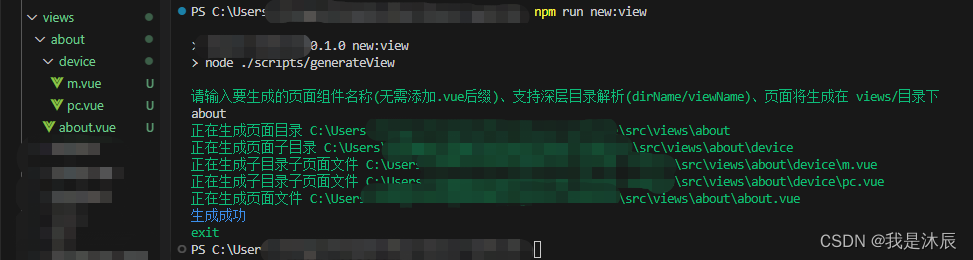
- 打开终端,输入
npm run new:view - 根据提示,输入要生成的文件名称(支持深层目录解析)
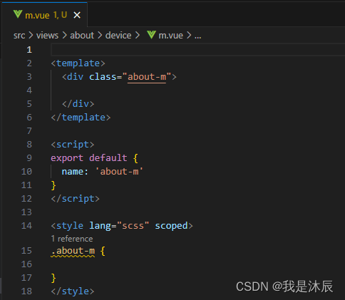
- 下图中我们创建了一个名为 about 的页面,可以看到,只需要一个指令及文件名,我们便得到了想要的页面结构,极大的提高了开发效率


3.持续优化
经过实践发现,pc端 和 移动端 的差别更多体现在页面元素的大小、位置、显隐上,而实际的业务逻辑变化并不大,上述方案中并未抽离页面的 js 代码,导致代码存在冗余,这里我们可以使用 mixins 来优化。
举例来讲,我们可以在首页 index 页面目录下添加一个 mixin.js 文件,将 device/pc.vue 和 device/m.vue 的公共业务逻辑抽离到该文件中,从而实现复用。
因项目较小,我也是后知后觉的才想到可以进一步优化,现如今项目已部署,因此就没有再调整,可以按照上述方案自行优化调整。
到此这篇关于vue如何实现pc和移动端布局的文章就介绍到这了,更多相关vue pc和移动端布局内容请搜索脚本之家以前的文章或继续浏览下面的相关文章希望大家以后多多支持脚本之家!