
css 两边固定中间自适应布局的实现
前端一锅煮
解析四种常用方法以及原理:浮动、浮动内嵌 div、定位、flex。
浮动
<style type="text/css">
    .wrap {background: #eee; padding: 20px; }
    p {margin: 0; }
    .left {width: 200px; height: 200px; float: left; background: coral; }
    .right {width: 200px; height: 200px; float: right; background: lightblue; }
    .middle {margin: 0 200px; background: lightpink; }
</style>

<div class="wrap">
    <p class="left">我在左边</p>
    <p class="right">我在右边</p>
    <p class="middle">我排最后,但是跑到中间来了</p>
</div>
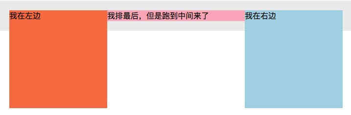
原理:
- 浮动元素和非浮动元素不在同一个立体空间,如果不清浮动,位置在它下面的元素将往上浮。
- 浮动元素高度为0,浮动盒子层级比
block块级水平盒子高,比inline/inline-block水平盒子低。
浮动内嵌 div
<style type="text/css">
    .wrap {background: #eee; padding: 20px; }
    p {margin: 0; }
    .left {width: 200px; height: 200px; float: left; background: coral; margin-left: -100%;}
    .right {width: 200px; height: 200px; float: left; background: lightblue; margin-left: -200px;}
    .middle {width: 100%; height: 200px;float: left; background: lightpink; }
    span{
        display: inline-block;
        margin: 0 200px;
    }
</style>

<div class="wrap">
    <p class="middle">
        <span class="inner">
            我在中间
        </span>
    </p>
    <p class="left">我在左边</p>
    <p class="right">我在右边</p>
</div>

原理:
- 三个元素都浮动,其中主题元素沾满一行 100% ,利用负
margin把左右两边的元素放好。 - 主题元素里面再套一个子元素,子元素
margin: 0 200px,防止内容跑到左右两块浮动元素下面被遮盖。
定位
<style type="text/css">
    .wrap {background: #eee; position: relative;}
    p {margin: 0; }
    .left {width: 200px; height: 200px; background: coral; position: absolute;left: 0; top: 0;}
    .right {width: 200px; height: 200px; background: lightblue; position: absolute;right: 0; top: 0;}
    .middle {height: 200px; background: lightpink; margin: 0 200px;}
</style>

<div class="wrap">
    <p class="middle">我在中间,我用 margin 抵消左右两块定位元素占据空间</p>
    <p class="left">我在左边,我是定位元素</p>
    <p class="right">我在右边,我是定位元素</p>
</div>

原理:
- 左右两个元素定位,可放任意位置。
- 中间元素用
margin: 0 200px,防止内容跑到左右两块定位元素下面被遮盖。
flex
<style type="text/css">
    .wrap {background: #eee; display: flex}
    p {margin: 0; }
    .left {width: 200px; height: 200px; background: coral; }
    .right {width: 200px; height: 200px; background: lightblue; }
    .middle {height: 200px; background: lightpink; flex: 1;}
</style>

<div class="wrap">
    <p class="left">我在左边</p>
    <p class="middle">我在中间,flex: 1 自动占据剩余空间</p>
    <p class="right">我在右边</p>
</div>
原理:
flex布局,子元素默认水平排列。flex: 0 1 auto-> 默认,占据空间不跟随父级放大,跟随变小,自身本来宽度flex: 1 1 auto-> auto,占据空间跟随父级放大,同时跟随变小,自身本来宽度flex: 0 0 auto-> none,占据空间不跟随父级放大,同时也不跟随变小,自身本来宽度flex: 1 1 1-> auto,占据空间跟随父级放大,同时跟随变小,并且自动占满剩余空间
以上就是本文的全部内容,希望对大家的学习有所帮助,也希望大家多多支持脚本之家。